


Widget Reference |
22 |
 |
Each widget description starts with a list of resources grouped by page in the resource panel. Also listed are the callbacks applicable to the widget. Although, strictly speaking, the callbacks for a widget are resources, they are added, edited and viewed in a separate callbacks dialog.
Core resources are not listed to avoid repetition. Resources in bold typeface are frequently set and so are of interest to users regardless of their level of expertise. Resources in normal typeface are less commonly used and you may require more knowledge to use them effectively. Resources that are in italics are not applicable to that widget and are insensitive on the resource panel.
Note - If you invoke WorkShop Visual using the command small_visu, the widget icons are smaller and slightly different from those shown here.

|
Settings |
Callbacks |
Toggles |
|
Arrow direction |
Activate |
Widget |
|
|
Arm |
Gadget |
|
|
Disarm |
|
The ArrowButton widget provides a button with an arrow on it instead of a text label. The arrow can point up, down, left, or right. Choose one of the four directions by selecting the appropriate direction from the option menu on the ArrowButton resource panel which is shown in Figure 22-1.
Text font
Focus
Button font
Map
Label font
Unmap
Widget
Accelerator
Gadget
Accelerator text
Mnemonic
Mnemonic charset
Mapping delay
Dialog type
Apply
Minimize buttons
Cancel
Must match
OK
File type
No match
Work area placement
Command changed
Command entered
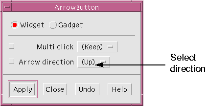
Figure 22-1 ArrowButton Resource Panel
22.3 BulletinBoard
The BulletinBoard widget is the most basic container widget. It is most commonly used internally by Motif to implement other container or composite widgets such as the Form, SelectionBox and MessageBox. These derived widgets are often more useful than the BulletinBoard itself.
Fonts
Callbacks
22.4 CascadeButton
The CascadeButton widget is used to display a menu. A CascadeButton can only be used as the child of a MenuBar or Menu. When it is the child of a MenuBar, a pulldown menu is displayed and when it is the child of a Menu, a pullright menu is displayed. Sample hierarchies showing these specific uses of the CascadeButton are located in the Menu widget description.
Toggles
Keyboard
22.5 Command
The Command widget is a composite widget used to select a command from a scrollable history list of commands. Commands can be typed into a text area at the bottom of the widget. When a command is entered, it is added to the end of the history list. A Command inherits some BulletinBoard resources. To display the BulletinBoard resource panel, click on "Bulletin Board Resources" in the resource panel.
Settings
Callbacks
Message text
Default button
OK label
Dialog type
Cancel label
Alignment
Help label
Minimize buttons
Symbol pixmap
Cancel
Ok
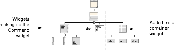
Figure 22-2 Command Widget Hierarchy
22.6 DialogTemplate
The DialogTemplate widget is usually used as the child of a Shell for a broad range of dialogs. It provides a standard layout that includes, from top to bottom, a menu bar, a work area, a Separator, and a button box.
Display
Settings
Callbacks
Width
Expose
Height
Input
Resize
Resize policy
Top
Activate
Bottom
Cascading
Left
Arm
Right
Disarm
Width
Expose
Height
Resize
Spacing
Value changed
Default shadow
Indicator size
Accelerator
Widget
Accelerator text
Gadget
Mnemonic
Mnemonic charset
Mapping delay
Dialog type
Apply
Minimize buttons
Cancel
Must match
OK
File type
No match
Work area placement
Command changed
Command entered
Text font
Focus
Button font
Map
Label font
Unmap
Margin width
Margin height
Title widget
Title spacing
Shadow type
Title alignment (horizontal)
Title alignment (vertical)
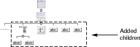
Figure 22-3 Standard Hierarchy Using the DialogTemplate
22.7 DrawingArea

Margins
Callbacks
22.8 DrawnButton
The DrawnButton widget is similar to a PushButton except that its face must be drawn by the application instead of being drawn automatically. It can be used to provide a button that has a context-sensitive appearance. 
Margins
Callbacks
Keyboard
Toggles
22.9 FileSelectionBox
The FileSelectionBox widget is a composite widget that lets users browse through the file system and select a file. The file browser in WorkShop Visual is an example of a FileSelectionBox. The Generate Dialog is a FileSelectionBox with a work area child. The FileSelectionBox is derived from the SelectionBox and shares its resource panel.
Settings
Callbacks
22.10 Form
The Form widget is a container widget that provides both absolute and relative positioning of its children widgets. It is commonly used to lay out widgets in a dialog, either as a child of a Shell or as the work area in a DialogTemplate or similar widget.
Fonts
Callbacks
22.11 Frame
The Frame widget is used to provide a border, possibly with a title, around a widget that otherwise has none, to enhance the border of a widget that already has one, or to create a border around a group of widgets. A Frame can be used to provide three-dimensional effects, like indenting a DrawingArea.
Display
Top
Activate
Bottom
Cascading
Left
Arm
Right
Disarm
Width
Expose
Height
Resize
Spacing
Value changed
Default shadow
Indicator size
Accelerator
Widget
Accelerator text
Gadget
Mnemonic
Mnemonic charset
Mapping delay
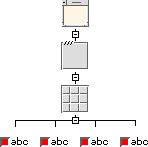
Figure 22-4 Hierarchy Showing a Frame Widget as a Border
22.12 Label
The Label widget provides a static display area for text or pixmap images. Labels are commonly used to display descriptive text strings or icons or logos. Labels can be placed in menus to provide unselectable titles for groups of menu items. 
Margins
Callbacks
Keyboard
Toggles
If you set a pixmap for a Label, the Label does not display it until you also change its "Type" setting to "Pixmap".
Margin width
Browse
Margin height
Default
Spacing
Extended
Visible items
Multiple
Top item
Single
Double click interval
Font
Automatic selection
Item
Selection policy
Size policy
Scroll bar display
Width
Width
Height
Height
Spacing
Traverse obscured
Scroll bar display
Scroll bar placement
Scrolling policy
Visual policy
Show separators
Command location
Message window
22.13 List
The List widget is used to display a list of text items, one or more of which can be selected, depending on the setting of the "Selection policy" resource.
Display
Callbacks
Settings
Items
22.14 MainWindow
The MainWindow provides a standard layout for an application's primary window. This standard layout includes, from top to bottom:
Scrolled window margins
Main window margins
Callbacks
Settings
The work area can be almost any other kind of widget. It can be a container widget with other widgets as children. A MainWindow ordinarily displays a scrolled window onto a work area whose size is fixed. If your work area is a Form, you may want to change the "Scrolling policy" resource to "Application defined". This removes the scroll bars and lets the Form resize with the window so that you can use the features of the Layout Editor to control resize behavior.
If you do not add a work area to a MainWindow, the generated code produces warning messages when you run it.
Note - "Scrolling policy" does not take effect in the dynamic display but works correctly in the generated code.
Careful use of resources can make a Form emulate the behavior of a MainWindow. Experience has shown that it is often more convenient to use.

| 1
Only if used as a PopupMenu. It is insensitive in all other cases.
|
|
Keyboard |
Callbacks |
|
Accelerator 1 |
Map |
|
Menu post1 |
Unmap |
|
Mnemonic |
Entry |
|
Mnemonic charset |
|
| 1
Only if used as a PopupMenu. It is insensitive in all other cases.
|
The active items in a menu can be PushButtons, ToggleButtons, or CascadeButtons. Menus can also contain Separators and Labels for display purposes.
To create a pulldown menu, add a Menu as a child of a CascadeButton that is a child of a MenuBar or OptionMenu. When a user clicks on the CascadeButton, the menu appears.
To create a pullright menu, add a Menu as a child of a CascadeButton that is a child of a Menu. When a user clicks on the CascadeButton, the menu appears. Pullright menus are only permitted in menus that are pulled down from a MenuBar, not in OptionMenus.
To create a popup menu, add a Menu as a child of a DrawingArea. When a user clicks on the DrawingArea with the right mouse button, the menu appears. A DrawingArea can have more than one popup menu as a child. In this case, the menu that pops up in the dynamic display depends on which menu is selected in the design hierarchy.
To create a Tear-off menu, set the Tear-off modal resource to enabled. Note that some Motif versions have a bug where, if this resource is not hard-coded and is part of the applications resource file, a call to XmRepTypeInstallTearOffModalConverter() must be made from either the main program or the Menu's pre-create prelude for the resource to take effect.
Figure 22-5 shows design hierarchies for the three types of menus.
Accelerator
Map
Menu post
Unmap
Mnemonic
Entry
Mnemonic charset
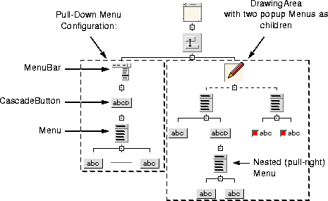
Figure 22-5 Sample Hierarchy Using Menus
22.16 MenuBar
The MenuBar widget displays a set of CascadeButtons from which you can pull down menus.
Keyboard
Callbacks
The default resource settings provide a standard menu bar as defined in the Motif Style Guide. You can change the "Packing" resource setting from "Tight" to "Column". "Tight" makes all buttons the minimum size to accommodate their text "Column" makes all buttons the same size
Message text
Default button
Cancel
Ok label
Dialog type
Ok
Cancel label
Alignment
Help label
Minimize buttons
Symbol pixmap
Accelerator
Map
Menu post
Unmap
Mnemonic
Entry
Mnemonic charset
22.17 MessageBox
The MessageBox widget displays a message to the user. WorkShop Visual's error messages are examples of MessageBoxes. The MessageBox is a composite widget that consists of three PushButton gadgets, two Labels and a Separator. These components are contained in a BulletinBoard that is not visible in the design hierarchy. To view the inherited BulletinBoard resources, click on "Bulletin Board Resources" in the resource panel.
Display
Settings
Callbacks
22.18 OptionMenu
The OptionMenu widget is used to display a one-of-many choice without using the screen space required by a set of radio buttons. The page selectors in WorkShop Visual's resource panels are examples of OptionMenus. 
Keyboard
Callbacks
Margin width
Margin height
Sash width
Sash height
Sash indent
Sash shadow
Spacing
Refigure
Separator
Widget
Accelerator1
Gadget
Accelerator text 1
Mnemonic 1
Mnemonic charset1
Mapping delay
Accelerator
Map
Menu post
Unmap
Mnemonic
Entry
Mnemonic charset
Accelerator
Map
Menu post
Unmap
Mnemonic
Entry
Mnemonic charset
Decimal points
Orientation
Drag
Minimum
Direction
Value changed
Maximum
Show value
Value
Title
Scale width
Scale height
Scale multiple
Font
Width
Scroll bar display
Height
Scroll bar placement
Spacing
Scrolling policy
Visual policy
Callbacks
Show separators
Traverse obscured
Command window
Message window
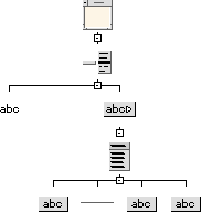
Figure 22-6 Sample Hierarchy for the OptionMenu
22.19 PanedWindow
The PanedWindow widget is used to lay out a set of widgets in a vertical column of uniform width. Each child widget is laid out in a vertical partition that is separated from adjacent children by a movable separator like a window sash. The user can move the sash to determine how much vertical space is allotted to each child. Since the height of a PanedWindow is less than the aggregate height of its children, a PanedWindow saves vertical space without sacrificing functionality. The children of a PanedWindow can be container widgets that control the layout of other widgets.
Margins
Settings
22.20 PushButton
The PushButton widget displays a button that can be "pressed" by clicking a mouse button over it. Like the Label, it can display either text or a pixmap.
Toggles
Keyboard
1
Sensitive when PushButton is child of Menu
22.21 RadioBox
A RadioBox widget is used to contain a group of ToggleButtons that act as radio buttons, meaning that they are mutually exclusive. Selecting one toggle in the group deselects the previously selected one. You can set the "Packing", "Columns", and "Orientation" resources to create multiple columns as for RowColumn.
Keyboard
Callbacks
22.22 RowColumn
The RowColumn widget is used to arrange child widgets in a grid. It is often used for arranging items such as groups of buttons or toggles. For example, a Menu is a specially configured RowColumn widget. Other widgets that are based on RowColumn are OptionMenu, MenuBar, Menu and RadioBox.
Keyboard
Callbacks
Note - When you use multiple columns, a RowColumn forces all items to be the same width. Sometimes this results in wasted space, as in the "Before" view of Figure 22-7, where the left column has short Labels and the right column has long TextFields. You can resize the TextFields to match the width of the Labels. However, although the new value is accepted in the resource panel, the difference in width is not apparent in the dynamic display until you have changed the value for all of the TextFields, as shown in the "After" view.
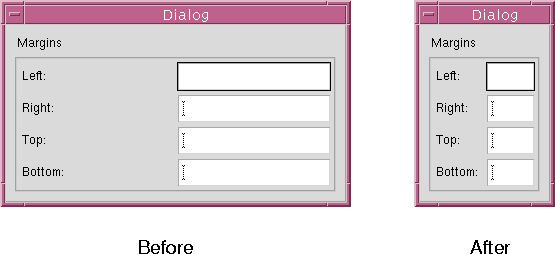
Figure 22-7 Resizing Widgets in a RowColumn
22.23 Scale
The Scale widget offers a range of values to choose from and displays a slider that can be moved to change the current value. You can drag the slider to move it continuously, click in the trough with the left mouse button to move the slider incrementally, or click in the trough with the middle mouse button to move the slider to the cursor location.
Display
Settings
Callbacks
22.24 ScrollBar
The ScrollBar widget lets users view data that requires more space than the display area provides. ScrollBars are rarely used alone. It is easiest to use them as part of a composite widget such as a ScrolledWindow, ScrolledList, or ScrolledText.
22.25 ScrolledList
The ScrolledList widget is a composite widget that displays a scrollable list of items. A ScrolledList is a specially configured ScrolledWindow that contains a List widget. The resources of a List widget child can be set in the normal way.
Margins
Settings
Width
Scroll bar display
Height
Scroll bar placement
Spacing
Scrolling policy
Visual policy
Callbacks
Show separators
Traverse obscured
Command window
Message window
Width
Scroll bar display
Height
Scroll bar placement
Spacing
Scrolling policy
Visual policy
Callbacks
Show separators
Traverse obscured
Command window
Message window
Dialog type
Apply
Minimize buttons
Cancel
Must match
Ok
File type
No match
Work area placement
Command changed
Command entered
Dialog type
Apply
Minimize buttons
Cancel
Must match
OK
File type
No match
Work area placement
Command changed
Command entered
Type
Widget
Orientation
Gadget
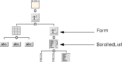
Figure 22-8 Effective ScrolledList Placement
22.26 ScrolledText
The ScrolledText widget is a composite widget that provides a scrollable text area. A ScrolledText is a specially configured ScrolledWindow that contains a Text widget. The resources of the Text widget child can be set in the usual way.
Margins
Settings
22.27 ScrolledWindow
The ScrolledWindow widget is used to display data that requires more space than is available. It is a composite widget consisting of two scroll bars and a viewing area onto a visible object that can be larger than the ScrolledWindow. A ScrolledWindow can have one child of almost any type.
Margins
Settings
22.28 SelectionBox
The SelectionBox widget is a composite widget used to select one or more items from a scrollable list. The SelectionBox combination includes a ScrolledList for the item list, two Labels, a Separator and four PushButtons, which are gadgets. These components are contained in a BulletinBoard widget that is not visible in the design hierarchy. To view resources inherited from the BulletinBoard, click on "Bulletin Board Resources" in the resource panel.
Settings
Callbacks
22.29 SelectionPrompt
The SelectionPrompt widget is used to prompt the user for text input. It is a composite widget consisting of a Label used for a question or prompt, a Text box into which the answer is typed and three PushButtons ("OK", "Cancel", and "Help"). An "Apply" PushButton is also provided. It is displayed by setting the "Managed" toggle in that PushButton's Core resource panel. These components are contained in a BulletinBoard that is not visible in the design hierarchy. To view the resources inherited from the BulletinBoard, click on "Bulletin Board Resources" in the resource panel.
Settings
Callbacks
22.30 Separator

Margins
Toggles
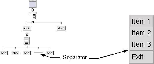
Figure 22-9 Use of Separator Inside a Menu
Set the RowColumn's "Spacing" resource to 0 to eliminate a gap between adjacent separators.
Pop down
Application shell
Pop up
Top level shell
Dialog shell
Activate
Text
Focus
Text Field
Losing focus
Gain primary
Lose primary
Modify verify
Motion verify
Value changed
Activate
Text
Focus
Text Field
Losing focus
Gain primary
Lose primary
Modify verify
Motion verify
Value changed
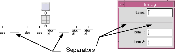
Figure 22-10 Use of Separators in a RowColumn (Horizontal Orientation, 4 Rows)
22.31 Shell
The Shell widget forms the interface between your design and the Motif window manager. Every WorkShop Visual design hierarchy must have a Shell as its root widget. 
1
Sensitive if Shell is set to Dialog Shell
Callbacks
Toggles
22.32 Text
The Text widget provides an area for entering multi-line text. A wide range of callbacks is provided to deal with input verification and validation.
Callbacks
Toggles
22.33 TextField
The TextField widget is a variant of the Text widget that provides an area for entering only a single line of text. It has all the Text's editing features except multi-line capability.
Callbacks
Toggles
Top
Accelerator1
Widget
Bottom
Accelerator text1
Gadget
Left
Mnemonic1
Right
Mnemonic charset1
Width
Mapping delay
Height
Spacing
Default shadow
Indicator size
22.34 ToggleButton
The ToggleButton widget provides a simple on/off toggle for indicating "yes/no" choices. 
Margins
Keyboard
Toggles
1
Sensitive when ToggleButton is child of Menu
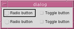
Figure 22-11 Radio Buttons and Normal Toggle Buttons
WorkShop Visual only generates bitmaps, icons and accelerators as Microsoft Windows resources. Other Motif resources are mapped to visual window attributes or written into the source code.
Create ( "Classical", WS_CHILD | WS_VISIBLE | WS_TABSTOP |
BS_AUTORADIOBUTTON, rect, this, IDC_shell_classical);
The second parameter to this method, which is a method inherited from a basic MFC class, is the window style. When you set resources in WorkShop Visual, suitable window styles are chosen. Below is a list of the window styles available for each widget which can be mapped to a Microsoft Windows object. The list also shows when they are used and the corresponding Motif resource.
Note - This does not mean that ApplicationShell and TopLevelShell are exactly the same on Microsoft Windows - they are different classes.