


Command Summary |
21 |
 |
Some menu items execute immediately, while others display a dialog where you must enter further information before anything happens. Commands that display a dialog have three dots (...) after the command name.
Many commands have keyboard accelerators which allow you to execute them with a single keystroke. The accelerators are listed in a table at the end of this chapter.
The variable name is the name used to identify that widget in the generated code. Variable names must be unique. If you do not specify a variable name, WorkShop Visual assigns a unique name of the form <widget-class><n>. The number n is not guaranteed to stay the same every time you open the design file. Therefore, you should never refer to a default name in your code.
Explicitly named widgets are global in scope. Those not explicitly named are local, unless you change this status on the Core resource panel.
The widget name can be the same as the variable name or different. Widget names do not have to be unique in a design. Groups of widgets that share a widget name also share any resource settings that are generated into the X resource file. See Chapter 7, "Generating Code", starting on page 219, for more information.
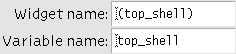
Figure 21-1 Text fields for Widget and Variable Name
21.3 The File Menu
Commands on WorkShop Visual's File Menu control only design files. Design files are the principal WorkShop Visual files and, by convention, have the suffix .xd. They contain a design hierarchy (which may consist of multiple dialogs), the resource values set on the resource panels, callbacks and links. 21.3.1 New
Clears the construction area so that you can begin a new design. If you have not saved your work since the last change, you are asked if you want to save before the construction area is cleared. 21.3.2 Open...
Opens an existing design file. You are prompted for the name of the file. If you have not saved your work since the last change, you are asked if you want to save before the new file is read in to replace it. 21.3.3 Read...
Merges the contents of a file into your current design. Since all design files begin with a Shell widget, this adds one or more dialogs to your design. 21.3.4 Save
Saves the current design using its previously specified filename. If your current design is new and has never been saved before, you are prompted for a filename as in "Save as...". 21.3.5 Save as...
Saves the current design under a specified filename. The WorkShop Visual file browser is displayed for you to specify a filename. Use this command when saving a new design file for the first time. 21.3.6 Print...
Prints the current design, or selected part of it, to a printer or a file. To print to a file, click on the "File" toggle and enter the filename in the text box under "File". To send to a printer, click on the "Command" toggle and enter the command, such as lpr, in the same text box, which is now labeled "Command". Because the output is Postscript, a Postscript printer or viewer is required. 21.3.7 Exit
Leaves WorkShop Visual. If you have not saved your work since the last change, you are asked whether you want to save before WorkShop Visual exits.
21.4 The Edit Menu
The Edit Menu has commands for editing the design hierarchy. All Edit options operate on the currently selected widget including all its children in the hierarchy. 21.4.1 Undo
Not yet available. 21.4.2 Cut
Removes the currently selected widget from the design hierarchy and copies it into the WorkShop Visual clipboard. 21.4.3 Copy
Copies the currently selected widget to the clipboard. 21.4.4 Paste
Copies the contents of the clipboard into the hierarchy as a child of the currently selected widget. 21.4.5 Clear
Deletes the currently selected widget. A confirmation dialog is displayed. Cleared widgets are not put into the clipboard and therefore cannot be pasted. 21.4.6 Copy to File...
Copies the currently selected widget to a clipboard file. You are prompted for the file name you want to use. 21.4.7 Paste from File...
Copies the contents of a clipboard file into the hierarchy as a child of the currently selected widget. You are prompted for the name of the clipboard file. If the widget at the root of the clipboard file hierarchy cannot be made a child of the currently selected widget, this operation shows an "Invalid hierarchy" error message. 21.4.8 Search...
Displays the search dialog. This is explained fully in the Search Chapter on page 7-1. 21.4.9 Move By Dragging
You can move a widget to another position in the hierarchy by dragging its icon with mouse button 1. This is the equivalent of using "Cut" followed by "Paste". 21.4.10 Copy By Dragging
You can copy a widget to another location in the tree by dragging its icon with mouse button 2. This is the equivalent of using "Copy" followed by "Paste".
21.5 The View Menu
The View Menu has commands that affect the appearance of the main WorkShop Visual window. Each command in this menu is a toggle and can be turned on or off. The View options only affect the appearance of the WorkShop Visual screen, not your design. 21.5.1 Show Variable Names
Displays the name of each widget in your design underneath the widget icon in the design area. The name shown is the unique variable name of the widget.
Figure 21-2 Show Widget Names
21.5.2 Show Dialog Names
Displays the widget name assigned to each Shell in your design underneath its icon in the window holding area. "Show dialog names" is particularly useful for navigating in designs that have multiple dialogs. Note that the Shell icon shrinks to allow room for the dialog name.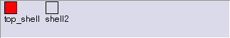
Figure 21-3 Show Dialog Names (Window Holding Area Shown)
21.5.3 Left Justify Tree
Changes the appearance of the hierarchy in the design area from a centered tree with branches spreading in both directions to a left-justified one with its branches spreading to the right.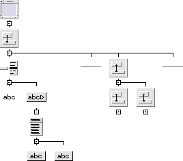
Figure 21-4 Left Justify Tree
21.5.4 Shrink Widgets
Reduces the size of widgets in the construction area. Use this option when the hierarchy you are building becomes large and you want to see the whole or a large proportion of the hierarchy. The widgets are shrunk to a uniform small square. As with the other View options, your actual design is not affected.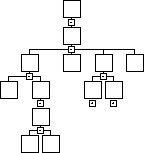
Figure 21-5 Shrink Widgets
21.5.5 Widget Annotations
Annotates widgets in the construction area according to specified criteria. You can request that the tree be annotated if the widget has:
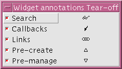
Figure 21-6 "Annotations" Tear-off Menu
21.5.6 Structure Colors
Color-code widgets in the construction area. When this option is on, separate colors are used to indicate those widgets in the hierarchy which have been designated as functions, data structures, C++ classes, or children only (via the "Code generation" page of the Core resource panel). These designations are discussed in the Structure Colors section on page 47. This option has no effect if all your widgets are default structures.
To turn on this option, click on the "Show colors" toggle in the pullright menu. You can tear off the pullright menu to use as a color reference, as shown in Figure 21-7. To tear off the menu, click on the dashed line.
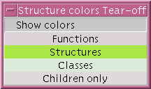
Figure 21-7 "Structure Colors" Tear-off Menu
21.6 The Palette Menu
The Palette Menu contains options which change the appearance of the Widget Palette. 21.6.1 Layout
Specifies whether the Palette is to be displayed with icons, labels, or both. Click on the appropriate toggle button in the pullright menu. 21.6.2 Separate Palette
Displays the Widget Palette in a separate sub-dialog. WorkShop Visual Window will then have more room for displaying the Design Area. You can select from and add to the separated Widget Palette in the normal manner. 21.6.3 Show Palette
Re-displays and raises the separated Widget Palette to the top of the window stack. This is a useful option when you have closed down the separated Widget Palette, or have lost it underneath all your separate application dialogs. This option is disabled if a separate palette has not been chosen. 21.6.4 Define
Designates the currently selected widget as a widget definition. This option is a short-hand method of creating widget definitions. The currently selected widget (if specified as a class) will form a new definition using some default configuration data deduced by context. 21.6.5 Edit Definitions
Displays the Edit Definitions panel which allows you to turn portions of your widget hierarchy into reusable objects selectable from the Widget Palette.
21.7 The Widget Menu
The Widget Menu has commands that apply to individual widgets. All these commands apply to the currently selected widget in the hierarchy. 21.7.1 Resources...
Displays the resource panel for the currently selected widget. You can also display the resource panel for most classes of widgets by clicking twice on the widget's icon in the design hierarchy.
21.7.2 Core Resources...
Displays the Core resource panel, where you can set resources inherited from the Core, Primitive and Manager superclasses. Core resources include foreground and background colors and whether or not a widget is sensitive to events. 21.7.3 Loose Bindings...
Displays the Loose Bindings Dialog. This allows you to control the way in which resources are generated in the resource file so that widgets can share resources. See the Loose Bindings section on page 90 for more details.
21.7.4 Layout...
Displays the Layout Editor. This option is available for the four classes of layout widget - the Form, BulletinBoard, RowColumn and DrawingArea. For more information, see Chapter 4, "The Layout Editor", starting on page 103.
21.7.5 Constraints...
Displays the constraints panel for any widget that is a child of a constraint widget - a PanedWindow or Form. In the case of the Form, this panel should usually be used only to view the constraint resources rather than to reset them, because Form attachments can be set more reliably in the Layout Editor. The Constraints panel is discussed in Chapter 3, "Resources", starting on page 53.
21.7.6 Callbacks...
This displays the Callbacks Dialog, as shown in Figure 21-8. You can set callbacks for the selected widget here. This dialog is described in detail in the Designating a Callback section on page 188.
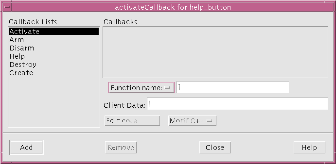
Figure 21-8 Callbacks Dialog
21.7.7 Translations...
Lets you specify translations for the currently selected widget. A translation is a key sequence that is mapped to a specified action on the widget. Translations can be one of two kinds, "Override" or "Augment". "Override" translations override any translations already set on the given key sequence. "Augment" translations are added to the list of translations already set.
21.7.8 Code Preludes...
Allows you to add pieces of code to the code generated for the currently selected widget. The most commonly used types are pre-create and pre-manage preludes. Pre-create preludes appear just before the widget is created. A typical use of pre-creation preludes is to set widget resources that can only be set at widget creation time.
Code preludes for private, protected and public methods apply to C++ class widgets. For more information, see the Adding Class Members section on page 307.
21.7.9 Method Declarations
Allows you to add, remove and edit method declarations in a widget's C++ class. 21.7.10 Reset
Destroys the currently selected widget and all its children and recreates them. This is useful after you set certain resources on the resource panels or in the Layout Editor. Sometimes creating a widget and then changing a resource value gives a different result from creating the widget initially with the changed value. Therefore, if your dynamic display does not reflect changed resource settings the way you expected, resetting widgets can often solve the problem. 21.7.11 Edit Links...
Allows you to you set up or remove links from widgets. Links are pre-defined Activate callbacks and can be set only on button-type widgets. Links can show, hide, manage, unmanage, enable or disable any widget. You can set multiple links on one button. 21.7.12 Fold/Unfold
Hides/displays the children of a selected widget. Use this toggle to save space when your design hierarchy becomes too large to fit in the construction area. When the selected widget is folded, its children are hidden, though they are not removed from the design. When a widget is folded, the fold icon changes to a plus sign (+). When it is unfolded, the icon is a minus sign (-). You can also click over this icon to fold or unfold the hierarchy.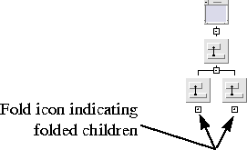
Figure 21-9 Folded Widgets
21.7.13 Definition
Marks the currently selected hierarchy of widgets as a reusable object definition. The definition can be inserted into the widget palette and then selected just like any other palette widget.
21.8 The Module Menu
The commands on this menu let you specify lines of code that are inserted into the primary module of generated code at specified points. Unlike code preludes, which are attached to individual widgets, module preludes and headings apply to the whole design. 21.8.1 Loose Bindings...
Displays the Loose Bindings dialog, allowing you to set loose resource bindings for the whole design. See the Loose Bindings section on page 90 for a description of the Loose Bindings dialog.
21.8.2 Module Preludes...
Displays a dialog box that lets you enter lines of code to be entered at or near the beginning of the generated code file. 21.8.3 Help Defaults
Displays a dialog which allows you to specify defaults for the help system. 21.8.4 Microsoft Windows compliant
This toggle (only present when WorkShop Visual is in Microsoft Windows mode) is used to indicate that the design is Microsoft Windows compliant, i.e. it is possible to generate MFC code for it. The toggle is set if the design is compliant. If the design becomes non-compliant, the toggle is unset and the Microsoft Windows Compliance Failure dialog is displayed (see the Compliance Failure section on page 342).
21.8.5 Application class...
The MFC and Motif XP flavors use an instance of the CWinApp class to represent the application. By popping up the Application class dialog you can change the base class name, the class name and the instantiate as name for this instance. This item is only present when WorkShop Visual is in Microsoft Windows mode.
21.9 The Generate Menu
When your design is complete, the Generate Menu can be used to generate code for it in three languages: C, C++, or UIL. The three menu items relating to these languages are pullright menus from which you can select the file you wish to generate. From this menu you can also generate an X resource file containing resource values explicitly set in your design, a Microsoft Windows resource file (if you are running in Microsoft Windows mode) and a Makefile. You can also select a general "Generate" option to display the Generate dialog and then specify all the files to be generated. The procedure for generating code, linking and running is discussed in Chapter 7, "Generating Code", starting on page 219.
If you select a particular file from the menu (C, C Stubs, C++ Stubs etc.), the generate dialog will only appear if you have not generated a file of that type before - otherwise the file will be generated silently.
Figure 21-10 Settings in Generate Dialog
21.9.1 C
Displays the C tear-off or pullright menu. 21.9.2 C++
Displays the C++ tear-off or pullright menu. 21.9.3 UIL
Displays the UIL tear-off or pullright menu. 21.9.4 X Resource File...
Generates an X resource file from your design. By convention, generated X resource files have the suffix .res. They must be copied to the filename expected by X in order to take effect. 21.9.5 Microsoft Windows Resources...
Generate a Microsoft Windows resource file and the associated bitmap (.bmp) and icon (.ico) files. The Microsoft Windows resource file typically has the extension .rc. This option is only present when WorkShop Visual is in Microsoft Windows mode. 21.9.6 Makefile...
Generates a Makefile to build your application. Specifying the code files in the Generate dialog sets the names for these files in the design file. Until you do this, the Makefile generation feature doesn't know the names of these files and cannot add them to the Makefile. 21.9.7 Generate...
Displays the Generate dialog, as shown in Figure 21-11. This dialog can be used to generate files, to save generate option settings and to enable you to see "at-a-glance" the files that you are generating.
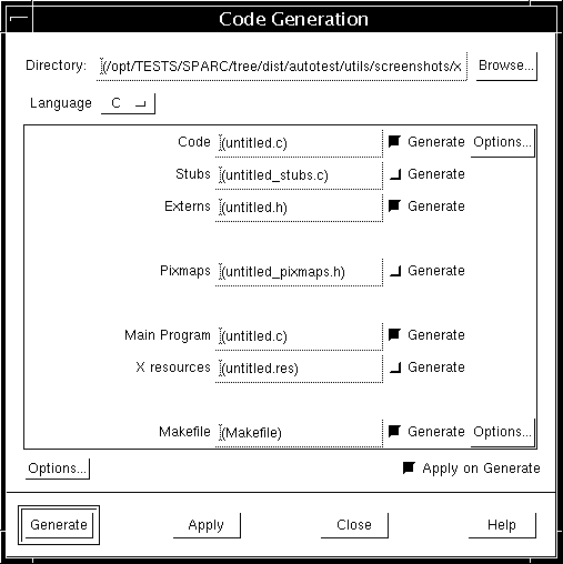
Figure 21-11 Generate Dialog
21.10 Tear-Off Menus
The procedure for generating code is basically the same regardless of your choice of language. The pullright menus for C, C++ and UIL can be torn off into a separate window by clicking on the dashed line at the top of the menu. You can also invoke commands from the pullright menu in the usual way without tearing off the menu. After you have displayed or torn off one of these menus, you can select one of the following commands. 21.10.1 C, C++, or UIL...
Generates the primary code module in the language of your choice. 21.10.2 Stubs or C++ Stubs...
Generates a stubs file, containing function declarations and empty braces for any callback functions you have designated in your design. Use of a stubs file ensures that your callbacks are declared with the proper syntax. You can then write code between the braces to add functionality. 21.10.3 Externs, C++ Externs, or Externs for UIL...
Generates a header file that declares all global objects and functions in your design. For convenient access to your global widgets and defined objects, #include this file in your primary code module or stubs file. 21.10.4 C, C++, or UIL pixmaps...
Generates static declarations of all pixmaps in your design into a separate file. This file is meant to be included as a header file and by convention has the suffix .h. 21.10.5 C for UIL...
Generates a C file that performs those functions in your application not covered by the UIL file. This command applies only to UIL applications. It exists because UIL does not have all the capabilities offered in WorkShop Visual. You must first generate a UIL file and specify the name of that file in the "Uid File" text field.
21.11 The Tools Menu
This menu contains a list of available tools. The tools fall into two categories: those that are independent but work in conjunction with WorkShop Visual and those that are an integral part of WorkShop Visual. 21.11.1 AppGuru
This is an internal tool which creates an initial user interface to help you get started. See the AppGuru section on page 410 for details.
21.11.2 Pixmap Editor
This is an internal editor for creating pixmaps. See the Editing Pixmaps section on page 160 for more details.
21.11.3 Font Selector
This is an internal tool for selecting fonts and creating font objects. See the Setting Fonts section on page 150 for more details.
21.11.4 Color Selector
This is an internal tool for selecting colors and creating color objects. See the Setting Colors section on page 145 for details.
21.11.5 WorkShop Visual Capture
This is a separate tool which captures the design of a Motif/Xt application of your choice. See the WorkShop Visual Capture section on page 416 for more details on capturing designs.
21.11.6 WorkShop Visual Replay
This is a separate tool which allows you to record your use of a Motif/Xt application of your choice and to replay the recorded script. See Chapter 13, "WorkShop Visual Replay" for more details on recording and replaying.
21.12 The Help Menu
The Help Menu offers the most general help messages.
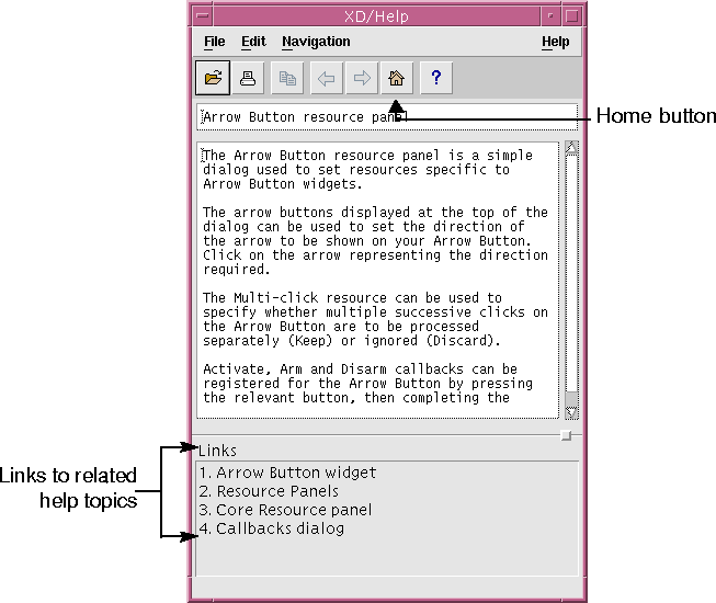
Figure 21-12 Help Viewer
21.12.1 About WorkShop Visual
Displays the WorkShop Visual copyright screen and the version of the software. 21.12.2 Palette Icons...
Displays a screen with pictures of all the Motif widget icons. You can click on any of these icons to get information about that widget class. The Palette Icons screen can be iconified independently of the main WorkShop Visual screen. 21.12.3 Help...
Displays the top-level help screen in the hypertext index. This screen offers a very general help message and the opportunity to follow links into more specific subjects. 21.12.4 Viewer
This is a pullright menu which allows you to choose which application to use to display WorkShop Visual help. There are two items in the menu: