Other Editors |
5 |
 |
In previous chapters, you entered settings for resources directly in the text boxes on the right side of the resource panels. To use the editors described in this chapter, click on the buttons on the left side of the resource panels instead.
WorkShop Visual displays the Color Selector, shown in Figure 5-1:
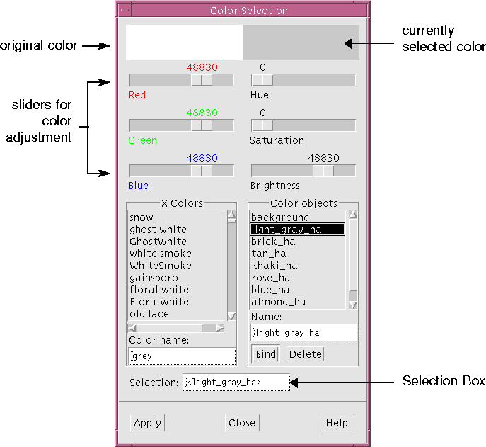
Figure 5-1 The Color Selector
5.2.1 Selecting from the X Colors List
X provides many pre-named colors. These standard colors make a good starting point for selecting colors for the interface.
This applies your selection to the "Foreground color" resource on the Core resources panel. To apply it to the widget, you must:
The "Strawberry" ToggleButton changes color in the dynamic display. Don`t worry if it looks like the background color changes instead of the foreground color; this is because the widget is selected in the hierarchy and the selection is reflected in the dynamic display by inverting the foreground and background colors.
To see the true colors:
Now you can see the true foreground and background colors of the "Strawberry" ToggleButton in the dynamic display.
The sliders at the top of the Color Selector let you individually control the red, green and blue components and the hue, saturation and brightness of your color. You can use the sliders in any order. Changes are reflected immediately at the top of the Color Selector. Notice that the color name is a concatenation of values.
Since this is a background color, a light (non-saturated) color is recommended. This provides a good contrast for the labels, which are darker.
Apply this background color to other widgets in the hierarchy by entering the color object name as the setting for the background color resource:
The color in the "Vanilla" ToggleButton changes. Now apply this background color to the "Chocolate" ToggleButton and any other widgets you want to share the same background color.
The background color is displayed at the top right of the Color Selector and "background" is displayed in the text field underneath the list of objects.
All the resources which refer to the color object change to the new color and the change is reflected immediately in the dynamic display.
Experiment with creating new colors, binding them to color objects and assigning these color objects to some color resources. You can also bind colors from the X colors list to color objects. By repeating these steps, you can build your own palette of colors. Remember that it is better to name a color object for the function it serves, such as "background", than for the color it represents, since the color can change.
Color objects are saved with the design file. This means you can use the same names for color objects in different design files, even though the colors might be different. For example, the color object, background, might be yellow in one design and light blue in another. Within the same design, however, an object name such as "background" always refers to the same color.
So far, you have used the default font for all text in the tutorial interface. In this section you will use the Font Selector to:
5.3.1 Selecting a Font
To add more visual interest to the tutorial interface, you are going to change some of the fonts from their default to an oblique font, as illustrated in Figure 5-2.
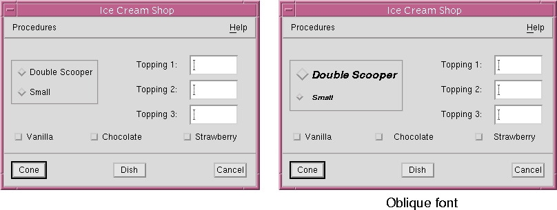
Figure 5-2 Toggle Buttons Before and After Setting Font
Figure 5-3 The Font Selector
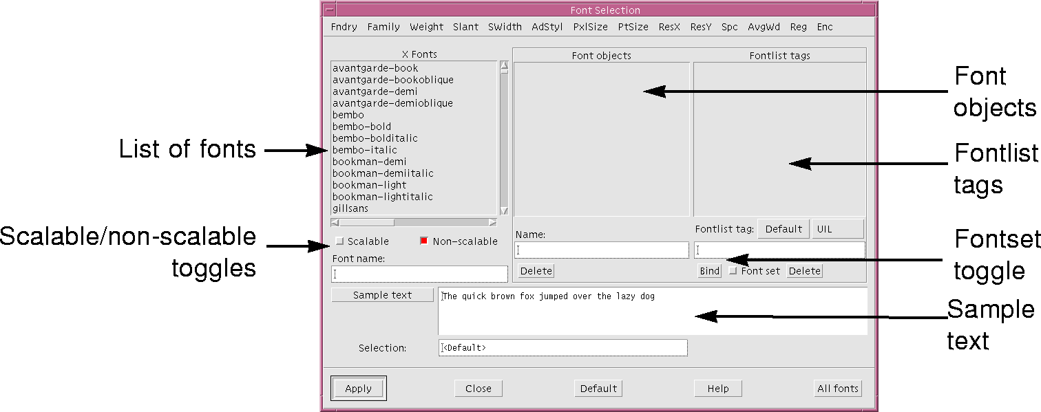
5.3.2 Regions of the Font Selector Panel
The Font Selector lists all the fonts available on your system. Because different machines may have different fonts installed, your list may look different from the figure.
5.3.3 Filtering the Font List
You are going to change the font of the "Double Scooper" label to 14-point bold oblique Helvetica. (If this font is not installed on your machine, select an alternative.) Because there are so many fonts in the list, it helps to filter the list. The "Font name" and "Selection" fields reflect your choices as you make them.
These steps reduce the font list to about four entries. A typical font name entry is shown in Figure 5-4. Although many fields are required to specify a font uniquely, most of them are only interesting to advanced typographers. The fields you are most likely to use are family, weight, slant and point size. You may also need to specify the display resolution such as 75 dpi (dots per inch) or 100 dpi. These fields are identified in Figure 5-4.

Figure 5-4 A Typical Font Name
Select the resolution appropriate to your display. If in doubt, use 100 dpi.
This applies your selection to the "Font" resource in the resource panel.
The "Double Scooper" radio button is now labeled in a large, bold, oblique font.
You can press the "Sample text" button to re-display the example text whenever the filtering has been changed. WorkShop Visual doesn't do this automatically as some fonts can take a very long time to load.
The "Small" radio button is now labeled in a bold, oblique font, smaller than the "Double Scooper" label. Before proceeding, reset the Font Selector panel so that it shows all the fonts:
This resets all elements of the font filter to "*" and so all available fonts are displayed again.
This eliminates all non-scalable fonts from the list and so the list is now empty.
This adds the scalable fonts to the list. You can specify a size for any of these fonts in two ways: by adjusting either the pixel size or the point size. The pixel size is the first numeric field in the font descriptor and the point size is the second numeric field. Both of these fields are initially set to zero for all scalable fonts, indicating a default size.
Your selected font appears in the "Font name", "Selection" and "Sample text" fields.
Typical point size values, specified in tenths of a point, are larger than typical pixel size values. A point size of 240 roughly corresponds to a pixel size between 30 and 35. The exact proportion depends on the resolution of your screen and the specific font.
X has two ways of scaling fonts: outline scaling and bit scaling. If the sample text is very jagged, the font is bit-scaled. To list only outline-scaled fonts, pull down the Fndry Menu and select "bitstream".
After experimenting, set the Font Selector to see the non-scalable fonts again:
Therefore, if multiple widgets use the same font, you can simplify both the code and maintenance of it by creating a simple font object. A font object is an alias for a list of fonts. A simple font object is an alias for a one-element list.
If more than one font appears in the list of X fonts, highlight one.
Remember that it is better to name a font object for the function it serves rather than for the size or style it represents, since these specifications can change.
This creates a font object called "option_labels". It only has one font in its list: the 12-point helvetica font. This has an associated fontlist tag "<Default>". The use of fontlist tags is discussed in the Compound Strings section on page 176.
This applies the font object to all the selected widgets.
The interface now looks as shown in Figure 5-5.
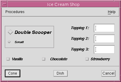
Figure 5-5 Interface with Fonts Applied
5.3.7 Changing the Font Object
The text on the ToggleButtons and Labels is now shown in the font to which the font object is bound. To change this font style, just bind the font object to another font.
The font object changes to correspond to the Times font and all the Labels and ToggleButtons change immediately in the dynamic display.
Font objects are saved with the design file. This means you can use the same names for font objects in different design files, even though the font might be different. For example, the option_labels font object might be Helvetica in one design and Times in another.
WorkShop Visual lets you use bitmaps created using the standard X bitmap editor. It also lets you use pixmaps in the public domain Xpm format and provides an editor for you to build pixmaps in this format. The Xpm library is included with the WorkShop Visual release.
WorkShop Visual displays the Pixmap Selector. This is shown with example entries in Figure 5-6:

Figure 5-6 The Pixmap Selector with Example Entries
This applies your selection to the "Pixmap" resource in the resource panel.
Now the ToggleButton has both a text label and a pixmap label, although only the text label appears in the dynamic display. To display the pixmap label, you must change the resource that controls which type of label is displayed.
The ToggleButton now displays the pixmap instead of the text label. Since the pixmap does not convey any useful information in this case, change the "Type" resource back to "String".
If you have additional X bitmap files on your system, you can also use these. Clicking on "Open..." displays a file selector which lets you locate bitmap files and add them to the list of X bitmaps.
You can also enter names of bitmaps in the text box under the list of X bitmaps, then click on "Add" to add the name to the list. If the bitmap doesn't exist yet, you can still add its name to the list and apply it to resources. Later, in development or at run time, you can supply the bitmap.
5.5 Editing Pixmaps
WorkShop Visual provides an editor for creating pixmaps. In addition to allowing you to design your own pixmaps, the Pixmap Editor also lets you:
All pixmaps used by widgets in WorkShop Visual must be bound to pixmap objects. First, you will create a pixmap for the "Cone" PushButton, as shown in Figure 5-7:
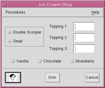
Figure 5-7 The Tutorial Interface with Pixmap Button
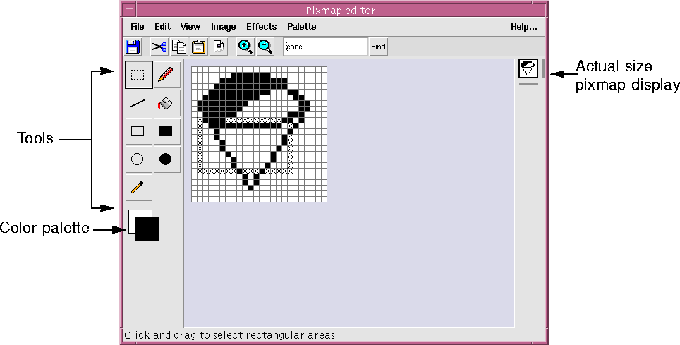
Figure 5-8 The Pixmap Editor
5.5.1 Pixmap Editor Toolbar
The toolbar, shown in Figure 5-9 contains buttons for the following operations:
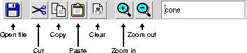
Open file
If you have X pixmap files on your system, you can also use these in your interface. Selecting "Open file..." in the File Menu displays a file selector which lets you load a pixmap file into the Pixmap Editor. WorkShop Visual reads pixmaps in XPM3 format. It also reads X bitmap files and converts the bitmaps to pixmaps for editing in the Pixmap Editor. Save XPM file
Selecting "Save XPM file..." lets you write the pixmaps you create to files. WorkShop Visual writes XPM1 and XPM3 format. You should normally save pixmaps in XPM3 format. XPM1 is provided for compatibility with older versions of third-party pixmap-handling utilities. Close
This closes the editor window. If you have made changes since last binding, WorkShop Visual will issue a warning. See the Pixmap Objects section on page 175 for details on binding images to objects.
Saving Your Work
Every time you bind or write to an XPM file, you effectively save the current state of the pixmap you are creating. It's a good idea to do this frequently as you work. 5.5.3 Pixmap Editor Edit Menu
The Edit menu has seven items: "Undo", "Cut", "Copy", "Paste", "Clear", "Crop" and "Select All".
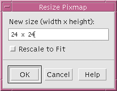
Figure 5-11 Resize Dialog
5.5.6 Pixmap Editor Effects Menu
The Effects menu has four items: "Reflect Horizontally", "Reflect Vertically", "Rotate 180" and "Gray Out". Reflect
"Reflect Horizontally" and "Reflect Vertically" reflect the selected area across a horizontal or vertical axis respectively. Rotate
"Rotate 180" rotates the selected area through 180 degrees - effectively reflecting the selected area across a diagonal axis. Gray Out
This item creates a grayed out version of the selected area by `xor'ing each pixel. This is useful for creating insensitive pixmaps. 5.5.7 Pixmap Editor Palette Menu
The Palette menu allows you to edit the color palette or read in a new palette. There are two items: "Edit Palette" and "Read Palette". Edit Palette
This produces the Palette Editor which is described in the Color Palette section on page 170.
Read Palette
This lets you read in the palette of a saved pixmap file. When you select this item, a file selection dialog appears prompting you for the name of an Xpm format file. When the file is read in, the palette of colors from the saved file replaces the existing palette. WorkShop Visual then changes the colors of the current image, if you have one, to use the colors of the new palette. WorkShop Visual will use the closest color match it can find. 5.5.8 Tools Palette
To help you draw and color your image there is a palette of tools on the left of the Pixmap Editor window, as shown in Figure 5-12.
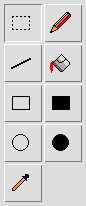
Figure 5-12 Tools Palette
You must select one of these drawing tools to perform an operation on the window. There is always one and only one tool selected at any time.
 This is the selection tool. You can select rectangular areas of the image. Many of the menu functions operate on the selected area.
 This is the filled rectangle tool. With this selected you can draw rectangles filled with the current foreground color.
 This is the fill tool. Click the mouse button over an area of the pixmap to fill that area with the current foreground color.
 This allows you to draw the outline of a circle using the foreground color. The circle is drawn from the centre.
 This enables you to draw individual pixels using the foreground color.
 With this selected, you can draw a circle from the centre filled with the foreground color.
 Select this to draw straight lines in the foreground color.
 This is the dropper tool. Use this to pick up colors from the image. Clicking over a color in the image while this is the selected tool sets that color as the foreground color. See the Tools Palette section on page 170 for a quick way of doing this.
 This allows you to draw the outline of a rectangle using the foreground color.
 Dropper Tool Shortcut
With any tool selected, clicking over a color with the Control key held down sets the foreground color in exactly the same way as the dropper tool. Clicking with Mouse Button 2 while the Control key is held down sets the background color. 5.5.9 Dragging into the Editing Area
You can drag pixmaps and pixmap filenames into the editing area using the Motif "drag and drop" mechanism. Usually this means pressing Mouse Button 2 over the source and dragging it into the Pixmap Editor editing area before releasing the mouse button. If this does not work, check with
your system administrator for your system's configuration. 5.5.10 Color Palette
Color palettes are important in the Pixmap Editor. In order to create color pixmaps you need to specify which colors you wish to use. Any colors defined in the color palette for a pixmap will be stored with the pixmap. While you are creating your image you need to be aware which colors from the palette are the current background and foreground colors. Background and Foreground Colors
The two squares of color below the tools palette show the current foreground and background colors. The foreground color is the color used for any drawing. The background color is used to fill blank space left by the editor. "Cut" and "Clear" both leave blank space which is filled with the background color. See the Pixmap Editor Edit Menu section and Pixmap Editor Edit Menu section on page 165 for details on these operations. "Gray out" uses the background color to produce the grayed out effect. See the Pixmap Editor Effects Menu section on page 167. Resizing to a larger size fills the extra space with the background color.
Swapping Background and Foreground Colors
When you draw anything in the Pixmap Editor, the current foreground color is used. If, however, you draw with Mouse Button 2 pressed down, the current background color is used. Seeing the Color Palette
Pressing the mouse button when the pointer is over either the background or foreground square displays the color palette.
Changing the Background and Foreground Colors
You can change the current background and foreground colors by displaying the color palette and releasing the mouse button over the new color. Changing a Color in the Image
If you have a color image and you wish to change all instances of one particular color to another, do the following:
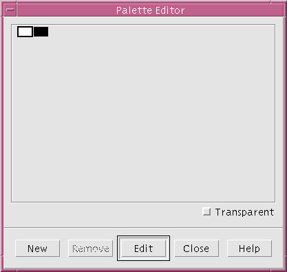
Figure 5-13 Palette Editor
5.6.1 Removing Colors
The "Remove" button removes the currently selected color from the palette. If that color was being used in the pixmap, it is replaced by the background color. 5.6.2 Adding Colors
Pressing the "New" button adds a color to the end of the palette. The new color is the same as the last color on the palette. 5.6.3 Editing Colors
To change a color, double click over it or select it and press "Edit". This invokes the Color Editor. See the Setting Colors section on page 145 for more details on the Color Editor.
5.6.4 Transparent Colors
If you set the toggle labelled "Transparent" for a selected color, the color will be "transparent" in the pixmap. This means that when the pixmap is displayed in the final application those areas of the pixmap which are transparent show the color that is beneath them. You may wish to use this so that the background of a button, for example, shows through parts of the pixmap. 5.6.5 Saving a Color Palette
A color palette is saved with the pixmap to which it is attached. There are, however, two options regarding color palettes when saving a pixmap:
Note - If you plan to use a lot of colors you should run WorkShop Visual with the "-L" command line switch, as described in the Command Line Switches for Interactive Use section on page 601, so that WorkShop Visual uses its own private colormap. Otherwise, you may not be able to use many colors.
5.7 Using the Pixmap Editor
First, set the size of the pixmap you'll be creating.
In the Pixmap Selector, the pixmap object name appears in the list of pixmap objects and in the selection box.
Pixmap objects are saved with the design file. This means you can use the same names for pixmap objects in different design files, even though the pixmap might be different. For example, the pixmap object, cancel, might be a cancel stamp in one design and the international "No" symbol in another.
If you want, try creating and adding pixmap objects for the "Dish" and "Cancel" buttons. Hint: the lettering for the "Cancel" stamp shown in Figure 5-14 was done with the line tool, not the pencil tool.
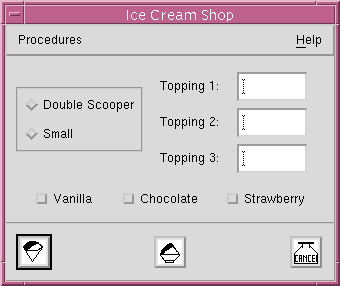
Figure 5-14 The Tutorial Interface with Three Pixmap Buttons
To most people a string is just an ordered list of ASCII characters - a character string. Most Motif resources that have string values use a different string representation: the compound string.
Motif compound strings are used for all string resource values except for the strings in Text and TextField, which are ordinary character strings. (It is important not to confuse the Motif compound string with the compound text format of X. The Motif compound string is often called an XmString because this is the naming convention for the Motif toolkit functions used to manipulate it.)
A compound string is a way of encoding text so that it can be displayed in multiple languages and fonts without changing the code. In this section, you will learn how to create a string to be displayed in multiple fonts. For information about using multiple languages, see Chapter 18, "Internationalization", starting on page 587 and your Motif documentation. Appendix D, "Further Reading contains some ideas for information on Motif.
Conceptually, a compound string consists of four types of component:
A compound string can be used for the label of a widget by specifying a fontlist for the widget's font resource. A fontlist is a set of (font, tag) pairs. The fontlist tags indicate which font in the fontlist to use for each text string component.
To familiarize yourself with the features of WorkShop Visual's compound string editor, use the following step-by-step example while running WorkShop Visual at your workstation.

| Select "New" from the File Menu. |
Figure 5-15 Final Appearance of the Text String
5.8.1 Creating a Complex Font Object
So far, you have learned how to select a font and apply it to a widget. You have also created a simple font object that corresponds to a single font. Complex font objects let you produce more complex visual effects. A complex font object corresponds to a list of fonts; different parts of a string can then be displayed using different fonts from the list. The step-by-step example in this section requires a complex font object.
type: italic
Next, add another font to the font object. The second font has a different tag.
Note - Tag names are arbitrary. However, several pre-defined tags are listed by the "Default" button and the "UIL" pulldown menu. The "Default" and "UIL" buttons are above the "Fontlist tag" field. Selecting the "Default" option produces the tag XmFONTLIST_DEFAULT_TAG. The UIL menu lists tags that can be used in UIL (Motif's User Interface Language). If you are a UIL user, note that most UIL compilers produce a "severe internal error" if you use a tag that is not on this list. If you are not a UIL user, ignore the UIL options.
Do not change the masthead font object name.
This adds the bold font to the font object list and tags it "bold". You can see samples of the two fonts in the "Sample" field by selecting the different tags in the "Fontlist tag" list.
You now have a font object that can be used to display a string using two different fonts. Apply it to the Label widget:
The text in the Label is displayed in the italic Times font because it is the first in the list. To display a text string that uses both fonts, you must create a compound string.
This displays the compound string editor, shown in Figure 5-16.
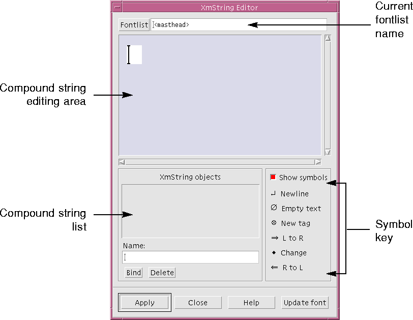
Figure 5-16 Compound String Editor
This makes the cursor blink, indicating that the editor is ready for text entry.
The text is displayed using the first font in the fontlist, which is the italic Times font, as shown in Figure 5-17.

Figure 5-17 Initial Text for the Compound String
This inserts the fontlist tag symbol and changes the display as shown in Figure 5-18.

Figure 5-18 Compound String with Fontlist Tag

Figure 5-19 Compound String with Fontlist Tags

Figure 5-20 Compound String Without Symbols
5.8.3 Creating a Compound String Object
Now you can create a compound string object and bind it to the string.
This applies the compound string object to the Label resource panel.
The text in the Label now displays the compound string in the selected fonts.
A newline causes a line break in the text. You can either press <Return> while entering text, or insert a newline using the pull-down menu. Before experimenting with inserting, moving and deleting newlines, make sure the "Show symbols" toggle is on so you can see what you are doing.
The direction indicators let you create text in either a left-to-right or a right-to-left direction. Although the default direction is from left to right, you can specify any portion of the string to be drawn from right to left.
If the "Show symbols" toggle is not on:
The compound string changes as shown in Figure 5-21.
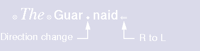
Figure 5-21 Compound String with Direction Change
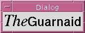
Figure 5-22 Final Appearance of the Text String
5.8.5 Updating Changes to the Font
If you create a new font object, or decide to use a different one while using the compound string editor, you can update the "Font" field in the widget's resource dialog by pressing the "Update font" button in the Compound String Editor. This ensures that the widget is using the same font object as the editor. This is not necessary if you have changed the contents of the font object - only if you want to use a different one.
5.9 Callback and Prelude Editing
WorkShop Visual provides a means of editing callbacks and code preludes. This facility is available once you have specified a callback and generated a stubs file or, in the case of code prelude editing, you have defined a code prelude and generated the primary source file.
When you ask to edit a callback or prelude you are given a text editor running inside an Xterm window. The editor used is determined by the editor application default which is described in Appendix , "Application Defaults".
If you have not already generated a stubs file or primary source file, you are prompted to do so.