


1.1 Introduction to WorkShop Visual
WorkShop Visual is an interactive tool for building graphical user interfaces (GUIs) using the widgets of the standard OSF/Motif toolkit as building blocks. WorkShop Visual lets you design a hierarchy of widgets on the screen quickly and easily by clicking on icons. It displays your design in two ways simultaneously: as a tree structure which represents the widget hierarchy and as a dynamic display--an active prototype which shows what your interface looks like and how it behaves. Interactive editing features let you browse through the hierarchy, cut and paste individual widgets and change widget resources. Because the dynamic display changes as you edit your widget hierarchy, you can immediately see the effects of your actions.
When your design is complete, WorkShop Visual automatically generates the code files required for your interface. You can compile, link and run the code generated by WorkShop Visual without modification as a prototype of your interface. You connect the prototype interface to your application code by writing connecting code. WorkShop Visual provides sample files which you can use as templates for the connecting code.
One way you can connect your WorkShop Visual interface to the application is by associating callback functions with specific widgets. For example, you can designate a certain routine to be called whenever the user clicks a certain pushbutton in the interface. Callbacks let your application receive and handle user events from the interface.
WorkShop Visual incorporates the tools WorkShop Visual Replay, WorkShop Visual Capture and AppGuru. All of these tools help you with your design. AppGuru provides you with the basics for your application while WorkShop Visual Replay and WorkShop Visual Capture let you update and examine your existing Motif applications. See Chapter 12, "Design Tools" for details on both WorkShop Visual Capture and AppGuru and Chapter 13, "WorkShop Visual Replay" for details on WorkShop Visual Replay.
WorkShop Visual can also be extended to use widgets from other X toolkits. Chapter 14, "User-Defined Widgets" discusses how to extend WorkShop Visual to include additional widgets.
WorkShop Visual typically generates code for use with the standard OSF/Motif and X toolkits. However, it can also generate code that will result in an equivalent interface on Microsoft Windows. The code can be structured in such a way that the majority of your application will remain the same on either platform. This technique makes extensive use of WorkShop Visual's C++ code generation facilities and is discussed in Chapter 10, "Cross Platform Development" and Chapter 11, "Cross Platform Tutorial".
1.2 Operating Environment
WorkShop Visual 2.0 requires one of the following configurations:
Note - Solaris 2.x for Developer System Support or Entire Distribution cluster has to be installed.
1.3 Requirements for Compiling Generated Code
In order to compile the code generated by WorkShop Visual, you will need the following:
To compile the MFC code generated when in Microsoft Windows mode, you will also require the following;
1.4 Basic Concepts and Terms
The following introduces some of the basic concepts of WorkShop Visual together with some of the terms used in this manual.
1.4.1 Widgets
Widgets are the building blocks used to create a user interface. Some widgets have a specific appearance and behavior in the interface display. Examples in Motif include PushButton, Label, and TextField widgets. Another type of widget is invisible itself but serves to contain and organize other widgets and is thus known as a container widget. Container widgets include the Form, BulletinBoard, MenuBar and RowColumn widgets.
All the Motif widgets, and any additional widgets which your configuration of WorkShop Visual uses, are represented by icons in a widget palette on the left side of the main WorkShop Visual screen. When you click on one of these icons, a widget of that type is added to the design. Individual widgets in the design are known as instances of a widget class. For example, if you click on the PushButton icon three times, you add three instances of the widget class PushButton to your design.
1.4.2 Design Hierarchy
The widgets in a design are organized in a design hierarchy which WorkShop Visual displays as a tree which has its root at the top and branches spreading downward. The design hierarchy is displayed in the large drawing area of the main WorkShop Visual screen, as shown in Figure 1-1. This area is called the construction area.
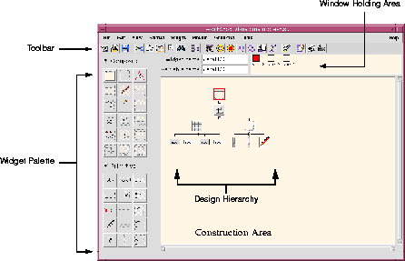
Figure 1-1 The Main WorkShop Visual Screen
Widgets added to the hierarchy are children of the parent widget immediately above them. This relationship is important because a parent widget can affect its children's appearance and behavior. For example, a RowColumn widget can impose a strict layout on its children which causes the children's size and position to change automatically.
Parent widgets appear above their children on the screen, as shown in Figure 1-2.
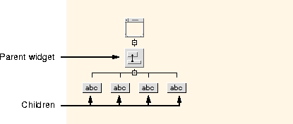
Figure 1-2 A Design Hierarchy
1.4.3 Resources
Resources are attributes of a widget which affect its appearance or behavior. Examples include dimensions, the content of a label or text field, and color. When WorkShop Visual creates an instance of a widget, it assigns valid default values for each resource. Interactive resource panels allow you to supply your own resource values.
Since resources and their valid values are defined by the widget manufacturer, and not by WorkShop Visual, it is not possible to document all of them fully in the WorkShop Visual manual. However, to aid you in learning WorkShop Visual, we discuss some commonly used Motif resources in this book. As you become more experienced, you should consult the Motif documentation for complete information about its widget set and the possible resource settings for each widget. If you are using widgets from other toolkits, consult the documentation from the widget developer for guidelines.
One group of resources (attachments) controls the spatial position of widgets within the Form container widget. WorkShop Visual provides an interactive editor, the Layout Editor, for setting attachments.
1.4.4 Gadgets
Some classes of widgets have counterparts called gadgets. Gadgets are like widgets but have a more restricted set of resources. Because gadgets are less expensive than widgets in terms of machine resources, they are sometimes preferred.
1.5 Protection from Invalid Actions
WorkShop Visual has many features designed to protect you from specifying widget hierarchies or resource combinations which are not valid in Motif. Commands that cannot be executed in the current circumstances, resources that do not apply to a particular widget and the icons of widgets that are not valid children of a proposed parent widget are grayed out on the screen, as shown in Figure 1-3. Grayed-out commands, resources, and icons have no effect if selected.
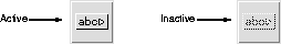
Figure 1-3 Active and Inactive CascadeButton Icons
WorkShop Visual also rejects invalid resource settings. An entry on a resource panel may be rejected for two reasons: either the value entered is outside the valid range, or you are trying to change a resource which is controlled or limited by the widget's parent. This subject is discussed in the Using the Resource Panels chapter. Motif's rules for resource settings are complex and invalid settings can have serious consequences. This feature of WorkShop Visual ensures that your resource settings are valid.
1.6 On-Line Help
On-line help is available throughout WorkShop Visual. For general help, pull down the Help Menu in the main window and select the "Help" option. There are two viewers which can be used to display help: WorkShop Visual Help and Netscape. Use the "Viewer" pullright menu in the "Help" menu to change between them. By default, WorkShop Visual Help is used. This is shown in Figure 1-4.
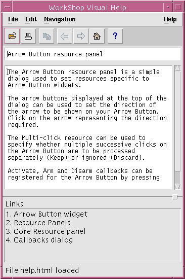
Figure 1-4 Help Viewer
WorkShop Visual Help has a menubar and a toolbar. There is a "File" menu for the usual file operations, an "Edit" menu for text editing functions and a "Navigation" menu for navigation commands. The toolbar buttons are shortcuts to many of the menu items. The status line at the bottom of the window informs you of each button's function as you move the mouse pointer over it. A list of related topics is displayed in the section at the bottom of the help viewer window. Double-click on one of these to view help on that topic.
Most dialog boxes and resource panels also have a "Help" button which you can click on for specific help about that dialog box.
The help viewer provided with WorkShop Visual can be built into your application to provide help for your users. This is described in the Setting up Help in WorkShop Visual section on page 578.
1.6.1 Using Netscape for Help
WorkShop Visual gives you the option of displaying hypertext help through Netscape.
To change to using Netscape, pull down the Help Menu, select the "Viewer" pullright menu, then select "Use Netscape".
In Netscape, you can use the usual navigation keys and commands. You can also click on any highlighted word or phrase in the text to follow a link.
1.6.2 Widget Palette Help
The "Palette Icons" option in the main WorkShop Visual Help Menu displays a copy of the widget palette with the name of each Motif widget icon. Clicking on any of the icons on this screen displays a description of the widget class of which the selected widget is a member. A list of the icons and their names is also available on the WorkShop Visual Quick Reference Card.
1.7 The WorkShop Visual Development Cycle
The process of creating WorkShop Visual applications usually involves the following four stages:
Designing the interface. This stage includes the following operations:
Generating code. WorkShop Visual automatically generates all the C or C++ code needed to display and operate your interface. WorkShop Visual can also generate a stubs file containing all the #include statements and function declarations necessary to connect the interface code to your application code.
Writing code. To connect your interface prototype to a real application, supply the necessary code between the empty function brackets in the stubs file.
Linking, running and testing. This phase follows the debugging cycle needed for developing any software program.
1.8 How This Manual Is Organized
This manual is organized in three main parts:
1.8.1 The Tutorial
Because WorkShop Visual is highly interactive, it is easier to learn its features by actually going through the steps for a simple layout than by reading descriptions of the various features. If you are new to WorkShop Visual, we recommend reading the tutorial chapters at your workstation and performing the steps given to build a simple interface. The tutorial begins on page 2-13 and continues through the following chapters, giving detailed instructions for all stages of the development cycle: building the design hierarchy, setting resources, adjusting the layout, setting callbacks, generating code and writing a very simple callback routine. At the end of the tutorial you will have a fully operational (if rudimentary) interface and you will have used all the major features of WorkShop Visual.
Knowledge of the X Window System and Motif is valuable at all stages of learning WorkShop Visual. However, if you are new to X or Motif, you can profit from the first several chapters of the WorkShop Visual tutorial while studying the documentation for X and Motif simultaneously. The bibliography in this manual provides a list of recommended books on X and Motif. At the code generation stage you must have some understanding of X and Motif, and one of the programming languages used by WorkShop Visual (C, C++, or UIL).
1.8.2 Power Use
The tutorial ends in Chapter 7, "Generating Code". The remainder of the manual covers advanced techniques for getting the most from WorkShop Visual. It is intended for users who are familiar with Motif and X and who have prior experience with WorkShop Visual or have finished working through the tutorial. There are sections dealing with the advanced code generation capabilities, Makefile generation, configuring the widget palette and toolbar, integrating user-defined widgets, advanced layout and internationalization. There are also short tutorials illustrating the structured code generation and cross platform development capabilities. In addition, there are chapters describing the design tools WorkShop Visual Replay, WorkShop Visual Capture and AppGuru together with details on how WorkShop Visual Replay can be extended.
1.8.3 Reference
The reference section is intended for WorkShop Visual users at all levels. It includes:
1.8.4 Conventions Used in this Manual
- 1. New terms occur in italics the first time they appear. These terms are defined in the Glossary.
- 2. The names of keyboard keys and mouse buttons appear in italics, enclosed by angle brackets: <Tab>. When two keys must be pressed simultaneously, we use this form:
- <1st key-2nd key>
- For example: <Ctrl-C>, <Meta-H>, <Shift-button1>
- 3. Text to be typed at the keyboard is shown in this format:
type this exactly
- without quotation marks. If quotation marks appear, they are to be entered with the text.
- 4. Some menu commands have keyboard accelerators--keystrokes which can be used to execute the command without using the mouse. In these instructions, we mention keyboard accelerators in parentheses after naming the menu command. The following instruction:

| Pull down the Widget Menu and select "Reset" (<Ctrl-T>).
|
- means to select "Reset" from the menu or press <Ctrl-T>--but not both.
- 5. File names, function names, and variable names are all given in italics. Function names are distinguished by empty parentheses after the function name: XtAppMainLoop(). Angle brackets indicate a variable portion of a name:
- The default widget name is in the form <widget-class><n>, where widget-class is a Motif class (button, label etc.) and n is a numeral.
- 6. "Click" always means to use mouse button 1 unless otherwise noted. Unless you have reconfigured your mouse, button 1 is usually the left button, button 2 the middle button and button 3 the right button.
- The instruction to "click twice" is different from "double-click". "Double-click" means that you must press the mouse button twice in rapid succession. "Click twice" can be done at any speed.
- 7. Names of Motif widget classes are capitalized: Label, PushButton. When similar words are used in an ordinary sense, they are not capitalized:
- The main window of this design does not use a MainWindow widget but a Form widget.
- 8. Books mentioned in the text of this manual are listed in Appendix D, "Further Reading".
