

6.1 Introduction
The aim of WorkShop Visual is to let you develop as much of your application as possible without writing code. You still need to write code, however, to make your application work as you intend and to link it to the user interface. You must also write code to control the behavior of the user interface. The following WorkShop Visual features make some of this easier:
This chapter uses the tutorial example built in the preceding chapters to demonstrate how to add a callback and how to add links to your design. The above topics are also examined separately in some detail.
6.2 Designating a Callback
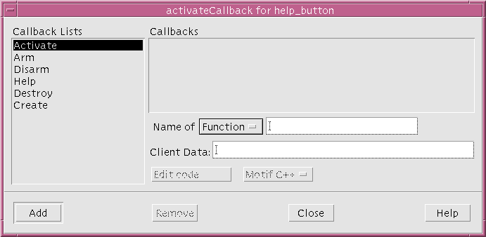
A callback list is a list of one or more callback functions designated to be triggered by user actions in your application. User actions include mouse button presses, keyboard selections and movements of the pointer. By setting up a callback, you can instruct your interface to call the functions on the callback list whenever a certain user action occurs within a widget. The callbacks dialog is shown in Figure 6-1.

Figure 6-1 Callbacks dialog
An "M" or "C" displayed to the right of a callback indicates that a method or callback respectively has been declared. An asterisk (*) indicates that the callback is not supported by Microsoft Windows.
In the following steps you will designate the simplest example of a callback by using the design from the tutorial of the preceding chapters. Clicking on the "Exit" button (exit_button) will trigger a callback list with just one function, quit(), which terminates the program.
The "Callbacks" dialog lets you associate lists of functions with user actions. You can associate quit() with exit_button now, even though quit() has not yet been written.
quit() and other callback routines are written in C or C++ and linked in with the code generated by WorkShop Visual. You will write your quit() routine in the Adding Callback Functionality section on page 239. The topic of writing callbacks is discussed in greater depth in the Callback Functions section on page 194.
- 1. Open your saved tutorial design.
- 2. Click on the "Exit" button (exit_button).
- 3. Click on the "Callbacks" toolbar button or select "Callbacks" from the Widget menu.
You are going to associate quit() with the "Activate" callback. Activating means that the user presses and then releases a mouse button while the pointer is located inside the widget. The user can also activate with the <Return> key, or other keys as described in the Motif User Guide.
When a callback in the "Callbacks" dialog is selected, the list of callback functions you have associated with it are displayed. To add an Activate callback:
- 4. Click on "Activate" in the list of Callback types.
This displays, in the list of callback routines, both those callbacks local to the widget and those inherited by it. Inherited callbacks are explained in the Inherited Callbacks section on page 190.
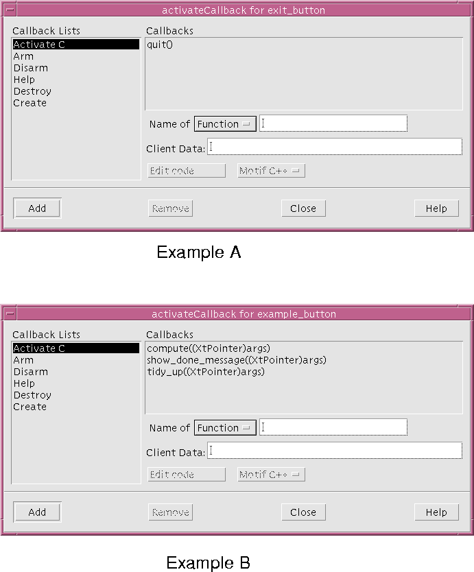
You may only change callbacks which have not been inherited. Figure 6-2 shows two typical examples. Example A of the figure shows the callback list for the "Exit" button in the tutorial interface; Example B shows a slightly more complex list.

Figure 6-2 Callback Text box and Two Examples of Syntax
6.2.1 Inherited Callbacks
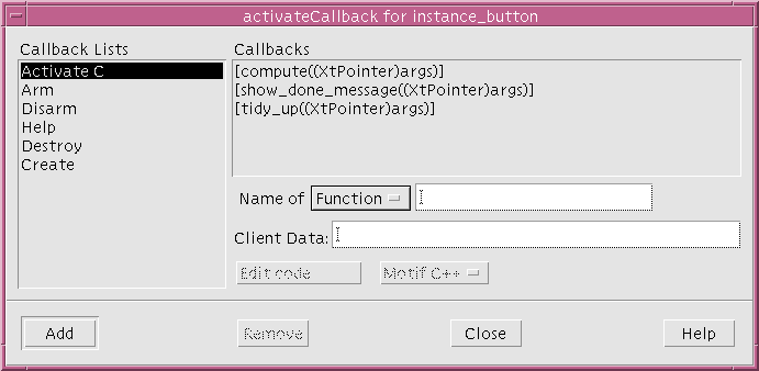
Widgets which are instances of definitions can inherit callbacks from the corresponding widget in the definition.
Inherited callbacks are shown enclosed in square brackets ([]), as shown in Figure 6-3.

Figure 6-3 Inherited Callbacks
6.2.2 Callback Syntax
In general, the syntax for each function call in the callback list is the same as C syntax. You do not, however, type them in as C code. Function brackets () are not required as these are added automatically.
Note - If you add function brackets or parameters to the name of the callback function or method these will be treated as part of the name - they will not be recognized as syntactically separate.
When we specify the name of the callback, we must also choose which language we are using.
- 1. If it is not already selected, choose "Function name" from the option menu.
- You should choose "Function name" if you are using the C language (as we are in the tutorial) or "Method name" if you are using C++.
- 2. Click in the "Function name" text box.
- 3. Type: quit
- 4. Click on "Add".
- Pressing Return has the same effect.
- 5. Close the dialog.
- 6. Save your design.
6.2.3 Order of Execution
While the callback list looks like C code, it has no logical flow. This means that you can neither use C's logical operators such as if...else and while, nor can you rely on your callbacks being executed in any particular order. All routines in your list will be executed whenever the specified event occurs but not necessarily in the order you type them. If the execution sequence is important, you can write a single callback function which contains subroutine calls in the order you want.
6.2.4 Client Data
The "Client Data" text box allows you to specify data to be passed in to the callback. It is better practice to use this mechanism when a callback needs to use some data than to use a global variable. Enter the string you wish to appear as the parameter here. You may also add a type cast in the usual C/C++ syntax. You do not, however, need to type the function parameter brackets () as these will be added for you automatically. See the Callback Function Parameters section on page 194 for more details about the parameters passed to callback functions and an example.
Note - You can only add client data to function callbacks, not to method callbacks.
6.2.5 Methods
The "Methods" button is only shown if the selected widget is enclosed in a C++ class. If this is the case, you can select "Methods" to view a list of callback methods already defined for that class.
Selecting one of these and pressing "OK" will place the selected item in the "Method name" text field. See the C++ Classes section on page 268 for details about the way in which widgets are enclosed in classes.
6.2.6 Edit Code
Pressing this button allows you to edit your stubs file (the generated file containing the specified callbacks) without leaving WorkShop Visual. This is dealt with in more detail in the Adding Callback Functionality section on page 239. See also the Setting up Callback and Prelude Editing section on page 615 for details on how to set up the editing feature so that you can use the editor of your choice.
6.2.7 Flavor Option Menu
The option menu next to the "Edit Code" button contains the possible code generation "flavors". The options are:
Note - The last two options are only shown in Microsoft Windows mode. See the Overview section on page 332 for information on these.
The Flavor Option Menu works in conjunction with the "Edit Code" button. When you edit your stubs file, you must specify which language you are using. WorkShop Visual will try to work this out for you and set the menu accordingly when you invoke the dialog. Sometimes this is not possible if, for example, you are working with two languages in the same design. You should, therefore, always check that the appropriate option is chosen from this menu.
6.2.8 Remove
The "Remove" button removes the currently selected callback. Be careful when using this button as the operation cannot be undone.
The tutorial example continues in the Links section on page 199. The chapter now continues with a more thorough explanation of callbacks and how they may be used.
6.3 Callback Functions
The Creation Procedures section on page 246 describes how WorkShop Visual creates the widgets in your application and sets their initial resource values. However, it is the callback functions and translations that make the application work. See the Translations and Actions section on page 208 for more information on translations.
Most callback functions have a similar structure. A typical callback function does some or all of the following:
6.3.1 Callback Function Parameters
A callback function receives three parameters:
The call data is a pointer to a data structure defined by the widget developer. Call data structures are described in your Motif documentation or documentation supplied by the developer of the widget toolkit. See the Books on X and Motif section on page 782 for details of some useful Motif documentation.
The client data is a pointer that you can use to pass the address of any variable or structure. When you register a callback, you can specify the value for the client data parameter that is passed to the callback function.
In WorkShop Visual, the client data is specified in the callback dialog as a single optional parameter of the callback function. See the Client Data section on page 192 for details on how to do this. This could be a pointer to a structure, which can be defined and initialized in a suitable prelude. For example, a typical prelude might be:
/* Pre-manage prelude for main dialog Shell */

/* Define and initialize client data for the rungrep callback */
static rcdata_t rcdata = {
&hitstring,
&errorshell,
&errorform,
&errortext,
&mainshell
};
/* End of Shell pre-manage prelude */
The callback is specified as:
rungrep((XtPointer)&rcdata)
To enter this in the Callbacks dialog, the function name rungrep is typed into the text field labelled "Function name" and the parameter, including the cast, is typed into the "Client data" text field: (XtPointer)&rcdata.
The declaration of the structure rcdata_t would normally be in a header file that would be included in the generated code (by adding "#include ..." as the module prelude) and in the callback function module. The callback function can then cast the client data to (rcdata_t *) and so access the data.
Note that the structure rcdata is defined to contain pointers to the widget variables, rather than the values of the variables themselves. This lets rcdata be initialized before the widgets are created. You can also define a structure into which the values of the widget variables are copied. However, this cannot be initialized until all the widgets have been created, which can be tricky.
6.3.2 Callbacks in C++
Ideally it would be desirable to add class member functions to widgets as callback functions. Unfortunately this is not possible because callback functions are called by a C library and they cannot provide the instance context (the this pointer) required by a class member function. WorkShop Visual provides an automatic way of calling a class member function from a callback. These are called callback methods and are discussed in the Callback Methods section on page 273.
6.4 Accessing Widgets in Callbacks
All callbacks are passed the address of the widget to which they belong. This is a variable of type Widget. In the WorkShop Visual generated code, the variable name of the widget is used for the name of this pointer. If you want a callback function to access widgets in your design other than the widget to which the callback belongs, you have the following choices:
6.4.1 Client Data Structure
Pass the other widgets as part of the client data structure. See the Callback Function Parameters section on page 194 for a description of this structure
6.4.2 Global Widget Variables
The simplest technique is to have WorkShop Visual define the widget variables as global. You can then access them from a callback function by declaring them as extern in the callback function module. You could include WorkShop Visual's generated "Externs" file in the stubs file in order to do this.
WorkShop Visual declares named widgets as global by default. You can change this behavior by setting the Storage Class of the widget in the Core resource panel.
The strength of the global variable approach is its simplicity. However, having many global variables does nothing for the structure of your program and you must pay attention to naming conventions to ensure meaningful names and avoid duplicates.
6.4.3 Inclusion of Generated Code
You can reduce the need for global variables by including the primary module in the callback function module, using #include. The primary module should be generated without includes of the X and Motif header files.
If you do this, WorkShop Visual still declares named widgets as global. You may want to change their storage class to static, which makes them local to the callback function module.
This technique works well where a callback function needs access to widgets that are all or mostly within a single design. In more complex situations, you can add accessor functions to the callback function module. A callback function that needs to manipulate a widget which is local to another callback module can do so via the accessor functions.
6.5 Manipulating Widgets
The Accessing Widgets in Callbacks section on page 196 gives you some ways to access the widgets in your design. Once you have a widget, there are many ways you can manipulate it. This section outlines a few of them. It is not a detailed description, but is only intended to point you to the appropriate functions and their documentation.
6.5.1 Toolkit Convenience Functions
The Motif toolkit provides a large number of convenience functions for getting and setting attributes of some widgets. These are all named after the widget class that they affect, such as XmTextSetString(), XmTextGetString(), XmToggleButtonGetState(). These are documented in the Motif Programmer's Reference.
Convenience functions are the first place to look. They are the easiest to use and are likely to be efficient.
One point to note is that convenience functions take a Widget parameter and expect this to be a pointer to a widget of the appropriate class. If the widget is of the wrong class, they commonly core dump. There are also both widget and gadget versions of some of the convenience functions and you may get a core dump if you use the wrong one.
6.5.2 Setting and Getting Resources
If there is no convenience function, you may have to get or set one or more of the resources of the widget directly using XtGetValues() or XtSetValues(). This is fundamental to widget programming and any book on Xt or Motif should cover it adequately.
Not all resources can be set after a widget has been created. The Motif Programmer's Reference documents the access controls on each resource of every widget class.
6.5.3 Enabling and Disabling Widgets
To disable a widget (that is, to make it insensitive to user input), or enable it again, use XtSetSensitive(). You should not set the resource XmNsensitive directly.
When a widget becomes insensitive, so too do all its descendants. Insensitive widgets are usually grayed out.
If you make a Text or TextField widget insensitive, the user cannot use key input to pan and scroll the text and so has only a limited view. It may be better to set the resource XmNeditable to False.
6.5.4 Showing and Hiding Widgets
There are two ways to make a widget appear or disappear: managing and mapping.
If a widget is unmanaged, its parent does not reserve any space for it and it is not visible on the screen. A widget is unmanaged using XtUnmanageChild() or XtUnmanageChildren() and managed using XtManageChild() or XtManageChildren(). WorkShop Visual generates code to manage widgets after they have been created, but the Managed toggle in the Core resource panel changes this.
If a widget is managed but not mapped, its parent reserves space for it. However, it is still not visible; there is a blank hole. Widgets are normally mapped automatically when they become managed. This is controlled by the resource XmNmappedWhenManaged which can be found on the "Settings" page of the Core Resource panel.
Mapping and unmapping is commonly used to change the visibility of widgets within a dialog without causing its layout to change. Managing and unmanaging cause layout changes.
You can make a complete dialog appear or disappear by managing or unmanaging the child of the Dialog Shell. If the dialog uses a Top level Shell, use XtPopup() and XtPopdown() on the Shell instead.
Note - The Links section on page 199 describes an automatic and dynamic means of showing and hiding widgets using WorkShop Visual`s built-in links facility.
6.5.5 Creating and Destroying Widgets
WorkShop Visual generates code to create the widgets for your dialogs. The default main() program calls all the creation functions at start-up time. Since widget creation is relatively expensive, this may cause an unacceptable delay. It is common practice to defer creation of a dialog until the first time it is popped up. A static Boolean flag in the callback function that performs the popup can be used to determine if the dialog has already been created.
As well as generating code to create complete dialogs, WorkShop Visual can generate creation functions for dialog fragments, as described in the Children Only Place Holders section on page 278. You can call these from a callback function, so as, for example, to create another instance of some reusable component.
To destroy a widget (and all its children), use XtDestroyWidget(). It is inefficient to destroy a widget and then recreate it; you should unmanage it, then manage it again when it is needed.
6.6 Links
WorkShop Visual has predefined callback procedures called links. There are six links available:
6.6.1 Distinction between Links and Callbacks
Only PushButtons, ArrowButtons and CascadeButtons can be the source of a link. All links are triggered by an "Activate" event. A link can show, hide, manage, unmanage, enable, or disable any widget in the design. One button can have multiple links.
Links are callbacks which WorkShop Visual sets up for you. Unlike callbacks, however, links work in the dynamic display and can therefore be used for prototyping window behavior. When you generate code, you can either include links, which work exactly as they do in the dynamic display, or substitute more complex callbacks for the simple links.
6.6.2 Restrictions on Adding Links
Links can only be added if at least one of the following criteria is met. If none are met, the "Add" button is disabled and no links can be made. The requirements are:
Note - If the variable name of a target widget changes, any links defined to that widget are no longer effective.
6.6.3 Setting Links in the Tutorial
You are now going to set a common configuration of links to display the help screen you have just built and make it disappear again at the proper time. To do this you will:
The "OK" PushButton is currently visible in the construction area and so begin by setting the "Hide" link on this PushButton.
- 1. Select the PushButton.
- 2. Double-click in the "Variable name" field.
- 3. Type: ok_button and press <Return> to register the new name.
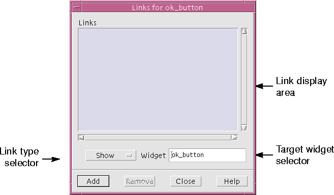
- 4. Pull down the Widget Menu and select "Edit links".
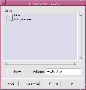
This displays the panel shown in Figure 6-4.

Figure 6-4 Default Links Panel
The target of the "Hide" link should be the widget help_window so that when the "OK" button is activated, the entire help screen disappears.
To select the target widget:
- 5. Select the Shell in the design hierarchy.
The name of the Shell, help_window, appears in the "Widget" field of the Links panel. However, the "Add" command is still disabled. This is because you have not yet named the DialogTemplate which is the immediate child of the Shell. As discussed above, the child of a Shell must be named explicitly before you can set a link to the Shell.
You can leave the Links panel open while you name the DialogTemplate:
- 6. Select the DialogTemplate.
- 7. Double-click in the "Variable name" field and type: dialog_2
- 8. Select the Shell.
The Shell is now a valid target widget and so "Add" is enabled.
Now select the type of link:
- 9. Select "Hide" from option menu of link types.
- 10. Click on "Add".
The new link appears in the link display area, as shown in Figure 6-5.

Figure 6-5 Links Panel with New "Hide" Link
- 11. Click on "Close".
To demonstrate the new link:
- 12. Click on the "OK" button in the dynamic display.
The help screen vanishes. You can restore it by resetting the Shell.
You can also set up a "Show" link to display the help screen when a button is pressed in the main window. To do this:
- 13. Click on the MyFirstShell icon in the window holding area.
The hierarchy for the main window is displayed in the construction area.
Set the new link on the PushButton in the Help Menu:
- 14. Select the help_button widget, the PushButton child of the second Menu.
The Links panel, unlike resource panels and the Layout Editor, does not automatically start adding links to the currently selected PushButton. To edit links for the currently selected button, you must:
- 15. Pull down the Widget Menu and select "Edit links".
The Links panel now displays the name and the links (none, so far) of the current PushButton. Select the target widget, which is the Shell for the help screen:
- 16. Click on the help_window icon in the window holding area.
In the Links panel:
- 17. Select the "Show" link type.
- 18. Click on "Add".
The new link appears in the link display area.
To demonstrate the behavior of these two links:
- 19. Click on the MyFirstShell icon in the window holding area.
- 20. Pull down the Help Menu in the dynamic display and select "About This Layout".
The Show link on this pushbutton makes the help screen appear.
- 21. Click on the "OK" button in the dynamic display of the help screen.
The Hide link on this pushbutton makes the help screen disappear. You can repeat the previous two steps as many times as you want.
- 22. Save your design.
6.6.4 Removing Links
To remove a link:

| Select the link's icon in the link display area and click on "Remove".
|
The tutorial continues in Chapter 7, "Generating Code. The remainder of this chapter looks at other ways of adding functionality to your application using WorkShop Visual.
6.7 Drag and Drop
Motif 1.2 provides a sophisticated drag and drop mechanism that lets applications communicate data via the X selection mechanism. WorkShop Visual provides some simple support to let you specify drop sites in your application. Because the initialization of a drag is a dynamic function that would normally be done from within a callback or action function, WorkShop Visual does not provide any explicit support.
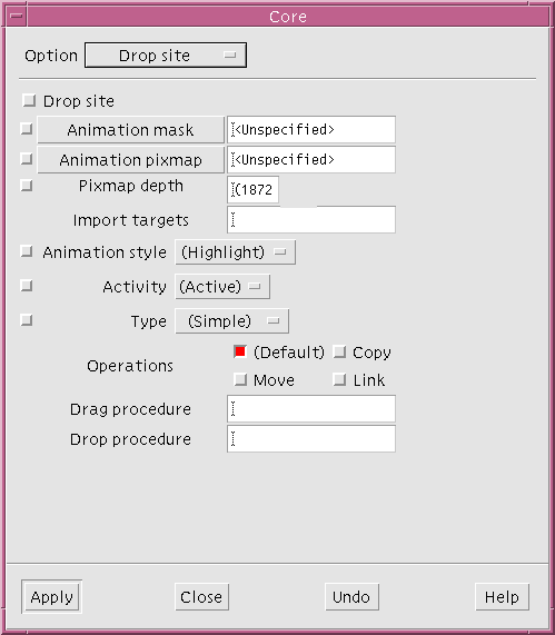
A drop site is a widget that is prepared to receive certain types of data from the transfer mechanism. WorkShop Visual provides its support through the Drop site page of the Core resource panel.

Figure 6-6 The Drop Site Page
To designate a widget as a drop site, simply set the "Drop site" toggle on and specify the import targets and drop procedure. The "Import targets" field is a list of strings that are converted into atoms to designate types that can be handled by the drop procedure. The list is specified as strings separated by commas or spaces.
By default Motif makes Label (and derived) widgets start a drag operation to transfer the labelString or labelPixmap if Button 2 is pressed over them. WorkShop Visual takes advantage of this by adding a drop procedure to the drop site widget that imports these types if specified in the import targets. The following tutorial lets you see how the drop site operates.
- 1. Create a dialog containing an Application Shell with a RowColumn containing two Push Buttons.
- 2. Name the widgets: shell, rowcolumn, MyButton1 and MyButton2 respectively.
- 3. Pop up the Drop site page for MyButton1.
- 4. Set the drop site toggle on and set animation style to "shadow in".
- 5. In the "Import targets" field, type: COMPOUND_TEXT
- 6. Press "Apply" but do not close the dialog.
WorkShop Visual warns you that you have not specified a drop procedure, which you must do for your application to work.
- 7. In the "Drop procedure" field, type: drop_button1
The drop and drag procedure fields specify the names of functions to be called to handle the drop and dynamic drags respectively.
- 8. Try dragging the text from any label in the tool bar (press MyButton2 and drag) across MyButton1 in the dynamic display window.
The button is shadowed in to indicate that it is a valid drop site for the target being dragged.
- 9. Release the mouse button to drop the text into the widget.
The drop procedure provided by WorkShop Visual simply copies the label into the widget.
- 10. Select MyButton2 and repeat Step 4.
- 11. In the "Import targets" field, type: PIXMAP
- 12. In the "Drop procedure" field, type: drop_button2
- 13. Try dragging a pixmap from the tool bar across MyButton2 in the dynamic display window.
For further examples of using drop sites and for information on starting drags, refer to the Motif documentation.
Code is generated for C and C++, with a call to XmDropSiteRegister() being generated for widgets that are not normally drop sites. Text widgets are drop sites by default, which can import COMPOUND_TEXT. This can be disabled by setting the drop site toggle off, or modified by simply changing the appropriate resources.1
extern void drop_button1 (Widget, XtPointer, XtPointer );
extern void drop_button2 (Widget, XtPointer, XtPointer );
shell_p shell = (shell_p) NULL;
shell_p create_shell (Display *display, char *app_name, int
app_argc, char **app_argv)
{
...
MyButton1 = XmCreatePushButton ( rowcolumn, "MyButton1", al,ac );
XtSetArg(al[ac], XmNanimationStyle, XmDRAG_UNDER_SHADOW_IN);
ac++;
/* Set up the import targets atom list for button1 */
atom_list = (Atom *) XtMalloc ( 1 * sizeof ( Atom ) );
atom_list[0] = XmInternAtom ( display, "COMPOUND_TEXT", False );
XtSetArg(al[ac], XmNimportTargets, atom_list); ac++;
XtSetArg(al[ac], XmNnumImportTargets, 1); ac++;
XtSetArg(al[ac], XmNdropProc, drop_button1); ac++;
/* Register the drop site for button1 */
XmDropSiteRegister ( MyButton1, al, ac );
ac = 0;
XtFree ( (char *) atom_list );
MyButton2 = XmCreatePushButton ( rowcolumn, "MyBbutton2", al, ac
);
XtSetArg(al[ac], XmNanimationStyle, XmDRAG_UNDER_SHADOW_IN);
ac++;
/* Set up the import targets atom list for button2 */
atom_list = (Atom *) XtMalloc ( 1 * sizeof ( Atom ) );
/* pixmap has pre-defined atom */
atom_list[0] = XA_PIXMAP;
XtSetArg(al[ac], XmNimportTargets, atom_list); ac++;
XtSetArg(al[ac], XmNnumImportTargets, 1); ac++;
XtSetArg(al[ac], XmNdropProc, drop_button2); ac++;
/* Register the drop site for button1 */
XmDropSiteRegister ( MyButton2, al, ac );
ac = 0;
XtFree ( (char *) atom_list );
...
}
You must write the drop procedures to handle the transfers.
6.8 Translations and Actions
Widgets have behavior. For example, when a user presses mouse button 1 over a PushButton, it highlights. When the user releases the mouse button, the PushButton's appearance reverts to normal and the functions on the Activate callback list are invoked.
This behavior is not hard-wired into the PushButton widget. Instead, it is determined by the widget's translation table, which maps events to the actions to be taken in response to the events. When a widget is created, its translation table is initialized to contain a default set of entries. For example, the PushButton widget's default translation table includes these entries:
<Btn1Down>:Arm()
<Btn1Up>:Activate() Disarm()
To the left of the colon is an event specification; to the right are the names of the actions that the widget performs in response. A second table, the action table, is used to map the action name to the address of a function that performs it.
For example, the PushButton's default action table includes:
"Arm", Arm
"Activate", Activate
"Disarm", Disarm
The first item in each entry is an action name and the second is the name of a function. Convention and common sense dictate that the action and function names should be the same, or at least related in a well-defined way.
You can change the translation table of any widget within WorkShop Visual. You cannot change the action table of a widget. However, you can define new actions in an application-global action table which is searched after the one associated with the widget. This requires some coding, as described below.
Note - Translations are not supported on Microsoft Windows. For this reason, the Apply button in the Translations dialog turns pink when in Microsoft Windows mode.
6.9 Modifying a Translation Table
Modifying the translation table of a widget in WorkShop Visual is straightforward. To understand the procedure, do the following simple exercise in WorkShop Visual.
- 1. Create a simple widget hierarchy containing a PushButton.
- 2. Select the PushButton icon in the widget hierarchy.
- 3. From the "Widget" menu, select "Translations...".
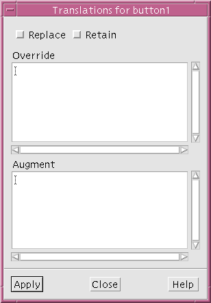
This displays the translations dialog, shown in Figure 6-7.

Figure 6-7 Translations Dialog
- 4. Click in the lower section, under "Augment", and type: Ctrl<Key>q: ArmAndActivate()
- 5. Click on "Apply".
This adds the new translation to the PushButton widget and you can now try its effect.
- 6. Place the mouse pointer over the pushbutton in the dynamic display window.
- 7. Type: <Ctrl-Q>
The effect is identical to clicking with mouse button 1. Note that translations do not work if the window does not have the input focus and that the input focus behavior depends on the configuration of your window manager.
You can also change the translations you have specified so that the button triggers on other events. Note that if you do this, the previous translation remains effective in addition to the new one until you reset the widget.
6.10 Augment, Override and Replace
The translations dialog has sections labeled "Override" and "Augment". You can enter new translations in either section or both. They only differ if you specify a translation with the same event specification as an existing translation. If you type the new translation into the "Override" box, your new translation replaces the existing one. If you use "Augment", the existing translation takes precedence.
The existing default translations for the widget are not affected when you add translations unless you override them. This is important because Motif widgets have many default translations that produce their expected behavior.
If you set the "Replace" toggle, however, all existing translations are removed and replaced by the translations you enter. Use "Replace" with caution. Do not confuse "Replace", which removes all the default translations, with "Override", which replaces them one by one.
6.11 Translation Table Syntax
The syntax of translation tables is complex. The following sections detail the syntax as used in WorkShop Visual. For a complete and definitive description, consult the X toolkit documentation.
Each entry in a translation table has the form:
[modifier_list]<event>[,<event>...][(count)][detail]:
[action([arguments])...]
Square brackets ([]) indicate that an item is optional; an ellipsis (...) indicates that the item may be repeated.
6.11.1 Modifier List
The modifier list represents the state (pressed or not pressed) of the modifier keys (such as Control and Shift) and the mouse buttons (X believes that a mouse has five buttons). The most useful modifiers are Ctrl, Shift, Alt and Meta. These can be abbreviated as c, s, a and m.
If the modifier list is omitted, the state of the modifiers is unimportant:
- <Key>Q matches <Q>, <Ctrl-Q>, <Alt-Meta-Q>, etc.
If a particular modifier is not mentioned in the list, its state is unimportant:
- Ctrl<Key>Q matches <Ctrl-Q>, <Ctrl-Meta-Q>, <Ctrl-Alt-Meta-Q>,...
You can specify multiple modifiers in the modifier list:
- Ctrl Meta <Key>Q matches <Ctrl-Meta-Q> but not <Ctrl-Q> or <Meta-Q>
To specify that a modifier must not be pressed, precede it with a tilde (~):
- Ctrl ~Meta<Key>Q matches <Ctrl-Q> but not <Ctrl-Meta-Q>
To specify that the modifiers pressed must exactly match what you specify, start the modifier list with an exclamation mark (!):
- !Ctrl<Key>Q matches <Ctrl-Q> but not <Ctrl-Meta-Q> or <Ctrl-Q> with a mouse button pressed.
The modifier "None" means that there must be no modifiers pressed at all.
- None<Key>Q matches <Q> but not <Ctrl-Q> or <Alt-Meta-Q>, etc.
Normally, translations are not case-sensitive. <Key>Q matches both <Q> and <q>. You can specify that a translation is case-sensitive by preceding it with a colon (:).
- :<Key>Q matches <Q> but not <q>
6.11.2 Event and Count
The event can be the name of an X event, or one of a number of aliases. Some of the most useful events are Key (a key press), BtnDown and BtnUp (for any mouse button) and BtnNDown and BtnNUp (where N is between 1 and 5). For a complete list of events and aliases, see the Xt documentation.
- <Key>a matches <a>
- <Btn1Up> matches a release of mouse button 1
You can specify a sequence of events in a translation, separated by commas.
- <Key>Q,<Key>A matches <Q> followed by <A>, with no intervening event.
- <Btn1Down>,<Btn1Up> matches a click of mouse button 1.
The count can be used with button press and release events to detect multiple clicks. The count is a number from 1 to 9, possibly followed by a plus (+).
- <Btn1Down>(2) matches two presses of mouse button 1
- <Btn1Up>(3+) matches 3 or more releases of mouse button 1
If a count is used, the button events must come close together (usually within 200 milliseconds of each other), or there is no match.
6.11.3 Detail
The final field in the event specification is the detail. This is normally used only with key events, where the detail specifies which key is to be pressed.
The value specified in the detail field is a keysym, as in the header <X11/keysymdef.h>, with the XK_ prefix removed. For most keys, this is the same as the character on the key.
- <Key>a matches <a>
For non-alphanumeric keys, check the name of the keysym. The keysym for "+" is XK_plus, so
- <Key>plus matches <+>
Since matching is case-insensitive, this also matches the other symbol on the plus key, which is <=> on most keyboards.
Motif adds another level of complexity by translating certain incoming key events into Motif virtual keysyms. You should use these virtual keysyms in your translation tables instead of the X ones.
- <Key>osfDelete, not <Key>Delete
The virtual keysyms are listed below. For details of their interpretation, see the VirtualBindings(3X) section of the Motif Programmer's Reference.
You can also use the detail field with mouse button events to specify a particular mouse button. This is not commonly done since it is easier to specify the mouse button in the event field.
- <BtnDown>Button1 is the same as <Btn1Down>
6.11.4 Actions
The actions on the right side of the translation table entry are simple. Usually each action is just a name followed by parentheses. Although any number of string arguments can be given between the parentheses, most action routines expect no arguments. Arguments should not be quoted. Typical additional translations for a ScrollBar widget might be:
<Key>d:IncrementDownOrRight(0)
<Key>u:IncrementUpOrLeft(0)
You can specify multiple actions or none at all. Overriding an existing translation with one that has the same event specification but no action is a useful way of disabling part of a widget's default behavior.
In many cases, the actions used are the ones predefined by the toolkit. The Additional Actions section on page 216 discusses how to add your own actions.
6.12 Translation Table Ordering
When an event is received, the translation table is searched from the top down. The search terminates at the first entry whose event specification matches the event. This means you should organize your translation table with the most specific events first. For example, a translation table might contain the following entries:
<Key>q: action1()
Ctrl<Key>q: action2()
When the user types either <Q> or <Ctrl-Q>, the search terminates at the first entry and action1() is invoked in both cases. To make <Ctrl-Q> invoke action2, you must reverse the order of the entries.
For additional subtleties in ordering translation tables, see the X toolkit documentation.
6.13 Available Actions
By changing the translation table, you can make a widget perform actions in response to event sequences that would not normally trigger those actions. While you can write your own action routines, translations provide the most benefit when you can use one of the built-in actions of the widget.
The built-in actions of the Motif toolkit are documented in the Motif Programmer's Reference. Each widget description includes both the default translations and the actions they invoke. Some of the primitive widgets offer a particularly large set of actions.
If you add a translation that uses one of these actions, you can test it in WorkShop Visual immediately. Alternatively, a few built-in actions, such as the PushButton's Activate() action, invoke the functions in one of the widget's callback lists. In this case, it may be easier to specify a translation to call that action on the appropriate event sequence and put the code in an ordinary callback function.
6.14 Additional Actions
If you cannot find a built-in action to suit your needs, you can write your own action routine to perform the action. You can specify the name of your action routine in the translations dialog. When you do, WorkShop Visual displays an "Actions not found" message to warn you that the action is not known to the toolkit. However, WorkShop Visual still registers the translation and generates code to add it in your final application. You can then write code to define the new action. It is invoked by the X toolkit when the appropriate event occurs.
In order for the toolkit to find your action routines, you must register them using XtAppAddActions(). This takes a record of type XtActionsRec, which defines the mapping from action names to action routines. Code like this is usually put into your initialization:
/* Define the actions table. */
static XtActionsRec myactions[] ={
{"action1", action1},
{"action2", action2}
};
...
/* During initialization, merge the extra actions into the global actions table. */
XtAppAddActions(app_context, myactions, XtNumber(myactions));
Since the actions table is global to the application, actions registered this way can be used from any widget.
The final step is to write the action routine itself. This is similar to a callback function but with different parameters:
void action1(widget, event, params, param_count)
void action1(Widget w, XEvent *event, String *params, Cardinal
*num_params)
{
/* Whatever code is needed to implement the action goes here. */
}
Note - The action routine does not get any client data. It does get (via params) the string arguments specified in the translation table and their number.


1
The comments which appear in the code are not generated.


