


Resources |
3 |
 |
When you add a widget to the design hierarchy, WorkShop Visual sets default values for all of that widget's resources. In most cases, however, you must set some resources explicitly to make the widget useful. To make it easy to set these resources, WorkShop Visual groups resources on dialogs called resource panels.
There are two types of resource panel - "Widget" and "Core". The Widget resource panel contains resources relevant to the class of the selected widget. The Core resource panel groups together resources which apply to all classes of widget because they apply to the base classes - Core, Primitive and Manager. All widget classes are derived from the Core class and most are also derived from either the Primitive or the Manager class. The Core resource panel is described in the Core Resource Panel section on page 81.
When you generate source code for your design, you can also choose to generate an X resource file. This is a separate file containing resource settings which may be altered by the end user. See the Setting up the X Resource File section on page 228 for details on resource files and their generation. As well as allowing you to control which resources should be generated into the resource file, WorkShop Visual also provides loose and tight bindings which give you greater control over the way in which resources are assigned to the widgets in your design. This is described in the Resource Bindings section on page 89.
In this chapter, you will use resource panels to:
3.2 The Label Resource Panel
To make the tutorial interface meaningful, you must set the text of all labels and buttons to something other than the default. Begin by changing the three labels in the RowColumn widget to the text shown in Figure 3-1.
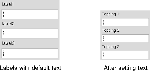
Figure 3-1 Labels Before and After Setting Text
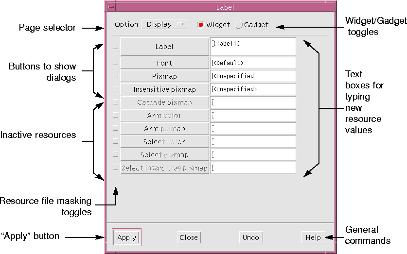
Figure 3-2 Label Resource Panel
Editing text in these boxes works in much the same way as assigning widget names. When you double-click, the first word in the box is highlighted. Triple-clicking highlights all the words in the box. Entering new text replaces the highlighted text.
The "Apply" command sets the new resource value. When you click on "Apply", the dynamic display shows the new label text.
Note - Do not press <Return>. Labels can contain multiple lines and pressing <Return> inserts a newline character into your label. If you unintentionally press <Return>, you can backspace to remove the newline.
Note - If your locale is not the default "C" and you are using international text in your labels, the text will not appear correctly until you have set up the fontlist resource required for your particular language. See the Setting the Application Font Resource section on page 599 for more information. See Chapter 18, "Internationalization" if you are not sure whether this applies to you.
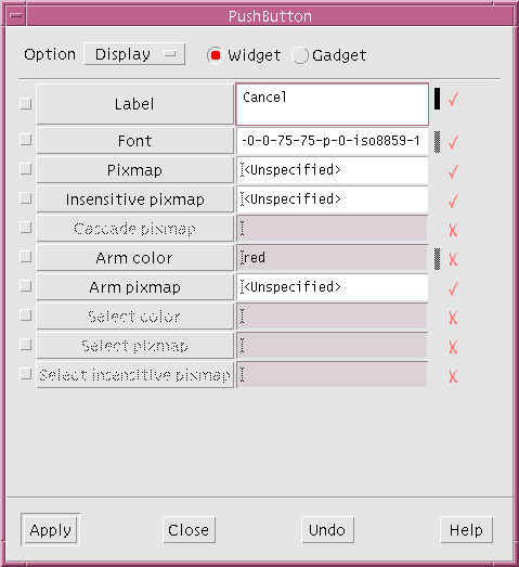
Figure 3-3 Annotated Resources
The tick and cross symbols shown in Figure 3-3 will only appear when running in Microsoft Windows mode. The tick indicates that the resource is applicable to Microsoft Windows and the cross indicates that it is not. This is explained more fully in the Widgets and Resources section on page 333.
Resource Names
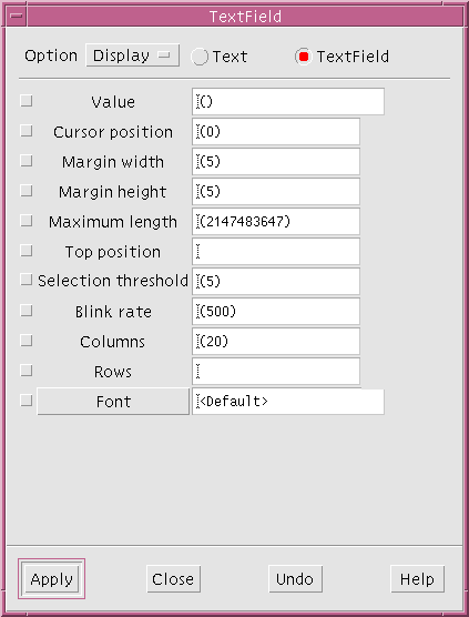
Resource names are shown on the left of a resource panel. Sometimes these names are simply labels and sometimes they are buttons which, when pressed, display a dialog relevant to the resource type. In Figure 3-2 above, all the resource names are buttons. Any resources that do not apply to the selected widget are grayed out.
Resource Values
Current resource values are shown in the boxes on the right. These boxes are either single-line text fields, multi-line text boxes or menu options. You can edit resource settings by typing into these boxes or selecting from an option menu. Default values are shown in parentheses. Masking Toggles
The unlabeled toggle to the left of each resource name is the resource masking toggle which can be used at the code generation stage to mask resources in or out of the X resource file. This topic is discussed in the Masking Resources section on page 235. You do not have to set these toggles in order to set resource values.
3.2.2 Page Selector and Toggle Switches
The main section of the resource panel usually has several pages. The option menu at the top of the panel is a page selector which lets you move from one page to another. The Label panel also has a toggle switch which can be used to designate this widget as a gadget. The widget-gadget toggle appears in the resource panels for other widget classes if the widget class has a gadget counterpart. Some widget classes also have other toggle switches appropriate to the class. 3.2.3 General Commands: Apply
The four buttons at the bottom of the panel offer general commands. "Apply" causes your new resource settings to take effect. If you do not click "Apply", your edited settings are lost when you select another widget or close the resource panel. 3.2.4 Undo, Close, Help
"Undo" makes all edited settings revert to the last applied settings. "Close" makes the resource panel disappear. "Help" displays the appropriate help screen.
Additional ways to edit in text boxes include: dragging with the mouse to highlight text, using <Delete> to delete highlighted text, or just typing at the current cursor location.
"Close" makes the resource panel disappear.
Resources are marked in the resource panels, according to their relevance to Microsoft Windows, in two ways:
3.5 Button Widget Resources
Use the same procedure as that used for the Label widgets to set the labels of ToggleButtons, CascadeButtons and PushButtons. Set labels for the ToggleButtons in the work area as shown in Figure 3-4.
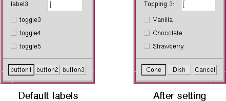
Figure 3-4 ToggleButtons Before and After Setting Labels
Several types of buttons - ToggleButtons, PushButtons, CascadeButtons and DrawnButtons - are derived from the Label class. You can set the text of all widgets of these classes using the same resource panel without having to close and re-open it.
Set labels for the radio buttons (the ToggleButtons in the RadioBox) as shown in Figure 3-5.
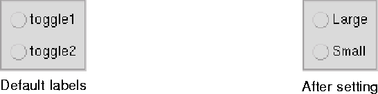
Figure 3-5 Radio Buttons Before and After Setting Labels
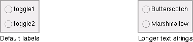
Figure 3-6 Radio Buttons With Longer Labels
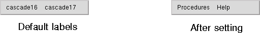
Figure 3-7 Menu Bar Before and After Setting CascadeButton Labels
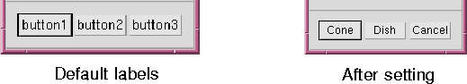
Figure 3-8 Button Box Before and After Setting Resources
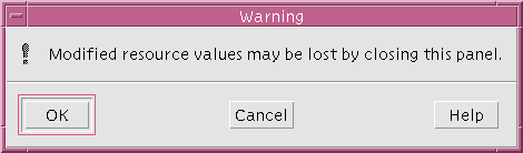
Figure 3-9 Warning that New Resources Were Not Applied
3.7 Resources for Menu Items
Next, set resources for the buttons in the pulldown menus of the menu bar. So far you have set only the CascadeButton labels and the pulldown menus look like Figure 3-10.
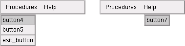
Figure 3-10 Pulldown Menus After Setting CascadeButton Labels
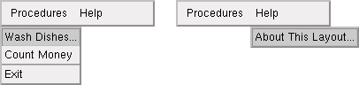
Figure 3-11 Pulldown Menus After Setting PushButton Labels
This brings up the "Keyboard" page, shown in Figure 3-12. The resources that are not grayed out are the ones which apply to the CascadeButton class.
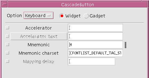
Figure 3-12 Keyboard Resources for the CascadeButton
3.8.1 Mnemonics
WorkShop Visual lets you set keyboard mnemonics which work like those in the WorkShop Visual interface. A mnemonic can be any character, even one which is not in the label. It is easiest for the end user if you use a character which appears in the label, preferably the first character. Mnemonics must be unique within a menu bar or menu.
These steps make the accelerator active. When the interface is running, <Ctrl-E> will have the same effect as the "Exit" button. The exact syntax of the accelerator is important. If a syntax error occurs, WorkShop Visual displays the error message shown in Figure 3-13 when you try to apply.
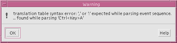
Figure 3-13 Accelerator Syntax Error Message
3.8.3 Accelerator Text
A related resource is accelerator text. This resource displays extra text to the right of a menu option to remind the user of its accelerator. Since accelerator text is just a display convenience, you do not have to use any particular syntax. "Control+E", "Ctrl-E" and "^E" are some common forms.
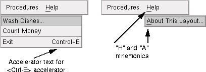
Figure 3-14 Pulldown Menus After Setting Resources
The MenuBar is a specially configured RowColumn and shares its resources. The resources that are not grayed out apply to the MenuBar.
To designate a Help widget:
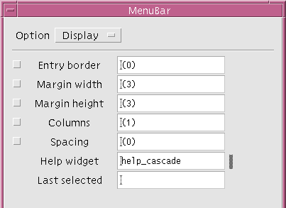
The dynamic display does not show this change automatically. To see the effect of designating the Help widget, resize the dynamic display.
Leave the MenuBar resource panel open.
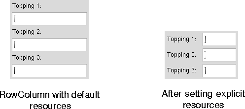
Figure 3-16 RowColumn Array, Before and After Setting Explicit Resources
If you already have the MenuBar resource panel up on your screen, it becomes active again although its title is changed to "RowColumn". If it is not on the screen, display it by double-clicking on the RowColumn again.
"Horizontal" orientation lays the RowColumn out in rows rather than columns. "Column" packing is necessary if the RowColumn is to have more than one row or column. To see the effect of these two resources:
At this point, the RowColumn appears in a horizontal row, with all the cells the same size. When "Orientation" is "Horizontal", the sense of rows and columns is reversed. Therefore, to make three rows you must set the "Columns" resource.
The result is shown in Figure 3-19.
Figure 3-19 RowColumn Portion of the Dialog with Horizontal Orientation
3.11 Shell Resources
The Shell widget exists primarily as an interface between your application and the X window system. Its behavior is mainly controlled by the window manager and by the widgets it contains. However, it does have a few interesting resources of its own.
All windows in the design close when the Application Shell is closed.
Note - The behavior described above applies to mwm. With twm, although Shell behavior is the same, it looks different because twm can turn Dialog Shells into pseudo-icons to reduce their size. The pseudo-icons are just a visual convenience for cleaning up your display. Internally, they are distinguished from true icons and they look different on your screen.
To remove them from the display, you must close them, either using the window manager or by clicking on a "Close" button, which closes the window internally via an "Activate" callback. All open Dialog Shells disappear when the main window is iconified and reappear when it is restored.
The "Palette Icons" help panel is an example of a Top Level Shell. While it does not come up automatically when WorkShop Visual starts, it can still be iconified independently once you have displayed it. Its popup subwindows, like all Dialog Shells, are children of the main Application Shell and do not close or iconify with the "Palette Icons" help panel.
Application Shell Requirement
You should designate at least one Shell in each design as the Application Shell. If you have no Application Shell in your design, the application will not display any windows. WorkShop Visual shows you a warning message at code generation time if you do not have an Application Shell.
3.11.2 Setting Resources for the Main Shell
The main Shell in your design, myFirstShell, must be an Application Shell. Therefore:
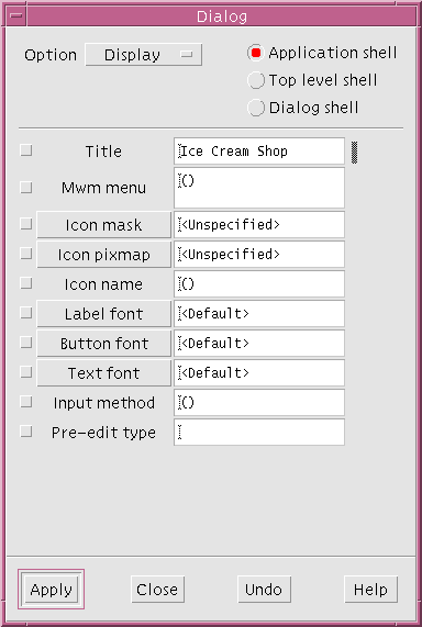
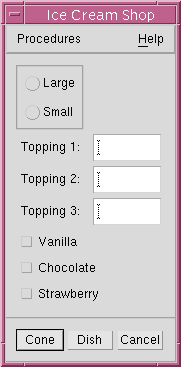
Figure 3-21 Tutorial Interface So Far
3.11.3 Setting Resources for the Secondary Window
In your application, you have another Shell for the Help window. This Shell should be a Dialog Shell.
You can also change the title on this Resource Panel.
Some resources that are not available on the resource panel of a specific widget class can be found on the Core resource panel, which is discussed in the Core Resource Panel section on page 81.
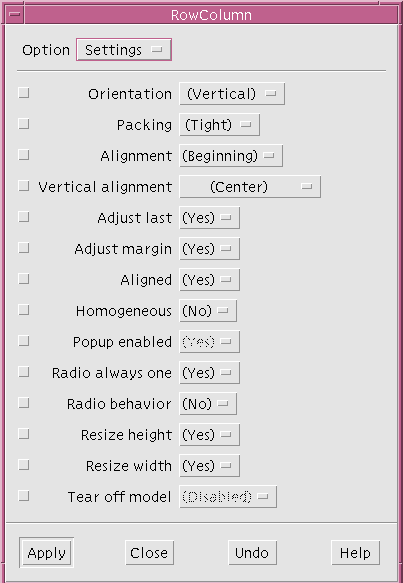
3.12.1 Settings
In general, any multiple-choice resource - one with a limited number of settings - is found on the "Settings" page, where you can set it with an option menu. All other resources that require you to type in a new value or call an additional dialog to set the new value are divided among the other pages. Except for the "Settings" page, resources are organized loosely by topic. 3.12.2 Display, Margins
Resources that affect the widget's appearance are generally found on the "Display" page. These resources include text, colors, fonts and dimensions. The Core resource panel also includes some resources that affect the dimensions and the location of the widget. 3.12.3 Keyboard
The "Keyboard" page lets you set keyboard mnemonics and accelerators for widgets that can have them.
3.13 Core Resource Panel
WorkShop Visual gives you access to resources for these broad superclasses via a single resource panel, the Core resource panel. To bring up the Core resource panel for a specific widget:
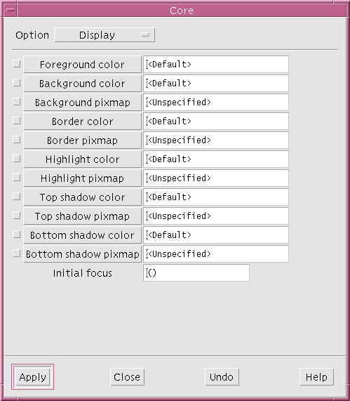
Figure 3-22 "Display" Page of the Core Resource Panel
3.13.1 Display Page of the Core Resource Panel
The "Display" page of the Core resource panel has basic color and pixmap resources. For example, you can set the colors for the widget's foreground, background, highlighting and shadows. You will do this in Chapter 5, "Other Editors".
3.13.2 Dimensions Page of the Core Resource Panel
The "Dimensions" page offers resources that affect the widget's size and location on the screen. Class-specific dimension resources may override the settings on the Core panel. You may want to experiment with the effects of setting "Shadow thickness" on a TextField or "Highlight thickness" on a PushButton. 3.13.3 Settings Page of the Core Resource Panel
The "Settings" page offers miscellaneous multiple-choice settings which apply to most widget classes. This page also allows you to change the "Map when managed" setting, which works in conjunction with the managed toggle, described below. 3.13.4 Code Generation Page of the Core Resource Panel
The "Code Generation" page gives you increased control over the generation of code. For example, you can designate a specific widget as static, local, or global. See the Accessing Widgets in Callbacks section on page 196 for a reason to change a widget`s access. If you are using C++, you can also designate it as private, protected, or public. The Widget Member Access Control section on page 294 discusses C++ access. The "Code Generation" page also allows you to create your own derived C++ classes. This subject is described in detail in the C++ Classes section on page 268.
Managed Toggle
The managed toggle also appears on the "Code Generation" page. By default all widgets are generated as managed, with the exception of the "Apply" button in a SelectionBox that is not a child of a Dialog Shell. This state can be modified using the "Managed" toggle in the "Code generation" page of the Core resource panel. Usually this just means that the code to manage the widget is omitted from the generated code. For widgets or gadgets that are components of composite widgets, the generated code explicitly unmanages the widget if the toggle is off, since the toolkit always creates these widgets as managed. For the "Apply" button of a Selection Box, code to explicitly manage the button is generated if the toggle is on. See the Manipulating Widgets section on page 197 for more information on widget manipulation.
Include in Resource Bindings Toggle
The toggle labelled "Include in Resource Bindings" refers to the generation of resources for the selected widget. This is explained in full in the Tight Bindings section on page 98.
3.13.5 Drop Site Page of the Core Resource Panel
This is where you can specify a drop site. A drop site is a widget that is prepared to receive certain types of data from other widgets by means of the drag and drop mechanism introduced in Motif 1.2. Drag and drop allows you to pass information between widgets by selecting the data and dragging it using the mouse.
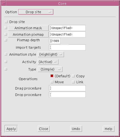
Figure 3-23 The Drop Site Page
3.14 Constraints Panel
Motif has two classes of widget, the PanedWindow and the Form, which are called constraint widgets. Widgets of these classes have a special set of resources, called constraint resources, that control the size and position of their children. A constraint widget maintains a separate set of constraints for each of its children. WorkShop Visual lets you set them as if they were resources of the children.
The constraints resources which the Form imposes on its children interact in complex ways and the preferred way of setting them is by using the interactive Layout Editor, which is discussed in Chapter 4, "The Layout Editor". The constraints resource panel is mainly useful for viewing the constraints which have been set, as an adjunct to the Layout Editor. Advanced users may want to set values on the panel itself. This can be done as with any other resource panel, by typing in the new value and clicking on "Apply".
The constraints resource panel for children of the PanedWindow displays a different set of values. This panel is discussed in the section on the PanedWindow in Chapter 22, "Widget Reference", starting on page 653.
3.15 Default Resource Settings
You may have noticed that WorkShop Visual displays default resource settings in parentheses. Default settings are different from explicit settings, even if the values are the same when you build the interface. The difference is that default settings are not added to the generated code or X resource files. If your interface uses default settings, and is then run on a machine other than the one used to design it, it will use the Motif defaults for the machine on which it is running.
Figure 3-25 shows a resource panel with some resources which have been explicitly set either in the current WorkShop Visual session or in a previous one. The explicit settings are those marked with a change bar.
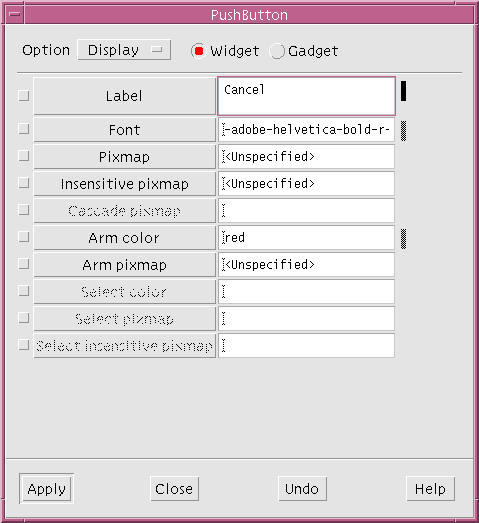
Figure 3-25 Resource Panel with Explicitly Set Resources
Note - The default value in this case will be the value currently being used in the dynamic display (i.e. the last value assigned to the resource). When the application is run outside of WorkShop Visual the system default will be used. To see the system default in WorkShop Visual, you will need to reset the widget.
Usually, the result of setting a value is the same as creating the widget with that value in the first place. However, this is not always the case. WorkShop Visual has a command on the Widget Menu, "Reset" (<Ctrl-T>), which destroys the selected widget and its children and recreates them with the most recently applied resource settings. If your layout does not look or behave as expected, try using the "Reset" command. The following steps demonstrate a case where "Reset" is required:
Resetting only affects the selected widget and its children. Resetting a widget that is low in the hierarchy may leave inaccuracies elsewhere in the dynamic display. If you set many resources, it is wise to reset the Shell to guarantee that what you see is what you get.
The "Reset" command is particularly useful when using the Form widget and its attachment resources. This topic is discussed in Chapter 4, "The Layout Editor".
For example, if you are designing an interface for use on a large-screen workstation, you might want to set a dimension resource to a large number of pixels. If you are designing on a smaller-screen machine, you may find you cannot set the value you want even though the interface will run on the large-screen machine later. (In this situation, you could still set the width you want by using an X resource file.)
When Motif rejects a new resource setting, it does not revert to the previous setting but calculates a new value based on defaults and other resource settings in the hierarchy. This new value is reflected on the resource panel and in your dynamic display.
The way resources and widgets are tied together is often referred to as a binding. One line is generated for each resource which has been explicitly set and which you have asked to be generated into a resource file. See the Resource File Syntax section on page 249 for a description of the format of resource files. The Code Generation Options section on page 232 shows how you can tell WorkShop Visual which resources to generate into the resource file.
There are two methods of setting resources in WorkShop Visual:
Tight bindings are a way of avoiding conflicts in an application's resource file. This is explained in more detail in the Tight Bindings section on page 98.
3.19 Loose Bindings
Setting a loose binding lets you specify a default resource that will be used if no explicit resource has been set. The loose bindings dialog allows a lot of flexibility because widgets can be referred to by their widget name, their class name or even by a wildcard indicating that any widget fitting the description is applicable. You can also specify how general to make the binding. This is explained in more detail in the example below. Loose bindings are useful if, for example:
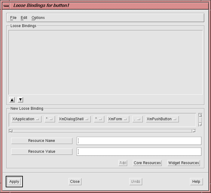
Menubar
This contains three menus: "File", "Edit" and "Options". The "File" menu contains commands to Load, Merge and Inherit bindings from external resource files. These operations are described in more detail in the Resources from External Resource Files section on page 95. The "Edit" menu allows you to delete bindings as well as cut, copy and paste them. The cut and paste mechanism is important because the order of the bindings in the list is the order they are generated. The order of resources in the resource file is significant because the file is read in order by the X toolkit. If there are any conflicting resources, the later resources override previous ones. The "Options" menu contains one option "Use Inherited Bindings" which allows you to decide whether or not to use any inherited bindings which appear in your loose bindings list. This toggle is set by default.
Currently Defined Bindings
At the top of the window is the list of currently defined loose bindings. Beneath the list there is an up and a down arrow button. Use these to change the order of the bindings in the list. The order in which the bindings appear in this list is the order they are generated into the resource file. Binding Under Construction
Underneath the list of existing bindings there is a scrolling window of option menus representing a binding for the selected widgets in the widget hierarchy. Resource Name and Value
Beneath the representation of the binding there are two text boxes - one for the name of the resource and one for its value. Resource Panels
At the bottom of the dialog there are buttons to bring up the core and widget resource panels. The resource panels relate to the bottommost widget that you have selected in the widget hierarchy (also known as the leaf widget). There is also a button to "Add" the binding to the list of those currently defined. 3.19.3 Creating the Binding
To continue with our example:
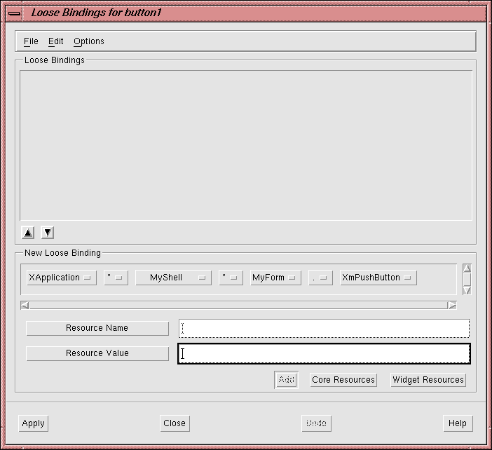
XApplication*MyShell*MyForm.XmPushButton.labelString: BoundWhen you next generate a resource file this will appear in it. In plain English this means:
All Push Button widgets which are children of Forms named "MyForm" which are descendants of Shells named "MyShell" (with any number of widgets in between) which are in an application of class "XApplication" will have their Label set to "Bound".
In order to inherit the bindings displayed in this dialog, set the "Use Inherited Bindings" toggle in the "Options" dialog.
When you next generate a resource file, if the toggle button in the "Options" menu is set, a reference to the named resource file is generated. This, in effect, inherits all the resources listed in the Inherit Bindings dialog. You can unset the "Inherited Loose Bindings" toggle if you no longer wish to inherit resources. If you unset the toggle button, no resource bindings are inherited.
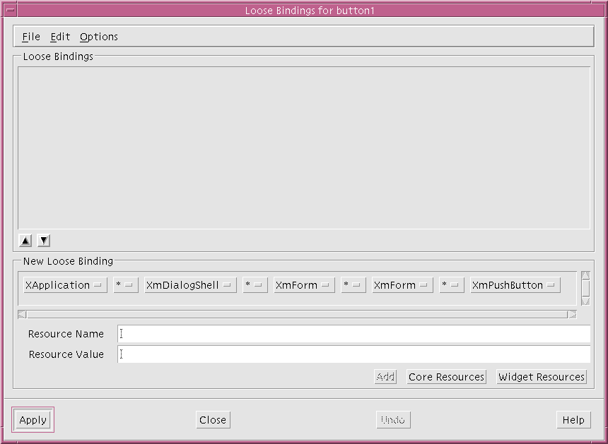
Figure 3-29 Current Binding with Corresponding Buttons
Note - If the name of a widget is changed loose bindings will not be re-applied to that widget until a reset is performed.
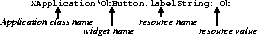
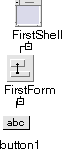
Figure 3-30 First Hierarchy
In an application you may find that you have more than one leaf widget with the same widget name. If, however, the widgets need different resources the default resource syntax described above would not be useful since it refers to all of them. Some resource settings would then be lost. The more widgets that are named in the resource binding, the less possibility of there being a conflict over widget names in the resource file.
Note - The variable name for this widget has not been set. In resource files it is the widget name which is important.
3.20.1 Example Tight Binding
Using the example above, the following shows how you can still have more than one leaf widget (in this case a PushButton) with the same name but with different labels.
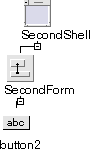
XApplication*FirstShell*OkButton.labelString: OkThe binding for the second hierarchy looks like this:
XApplication*SecondShell*OkButton.labelString: ApplyResources for the two buttons with the same widget name are now easily distinguished. You can add any number of widgets into the resource binding (in this example we could have added the Form as well). This would make the binding tighter and less open to ambiguity.
XApplication*button1.labelString:Bound
If you have used tight bindings, which are described in the Tight Bindings section on page 98, to set a tight binding for the Shell, MyShell, without specifying any loose bindings, the following line is generated into the resource file:
XApplication*MyShell*button1.labelString:Bound
If you have set a loose binding to encompass all the buttons, as described in the Example Loose Binding section on page 91, the following line is generated into the resource file:
XApplication*MyShell*MyForm*XmPushButton.labelString:Bound
3.22 Where to Look for More Information on Resources
For more information on widget resources see Chapter 22, "Widget Reference", starting on page 653. This chapter contains a summary of the most commonly used resources for each of the Motif widget classes. While this summary is necessarily brief, it will help you get started.
There are many books available that provide a more complete discussion of Motif widget resources. The Motif Programming Manual includes a summary which is both thorough and readable. Several other useful books are listed in Appendix D, "Further Reading".